Vanesa is an ambitious and active person, dedicated to her profession in podology and pleased with the results of her expanding business. She enjoys life in her own way: running in the mornings with her dog and taking cold showers make her feel alive. However, due to her increasing workload, she has less time to manage her personal and professional tasks throughout the day. She would like to optimize her time to be able to dedicate more time to her family and exercise, as she often forgets to book her training class or doesn’t have time to do so because of her work responsibilities. Nevertheless, she also likes to feel that she is making progress day by day in what she does.
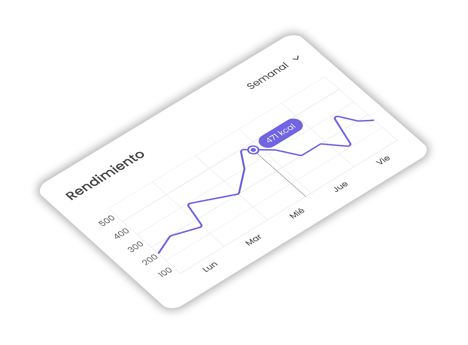
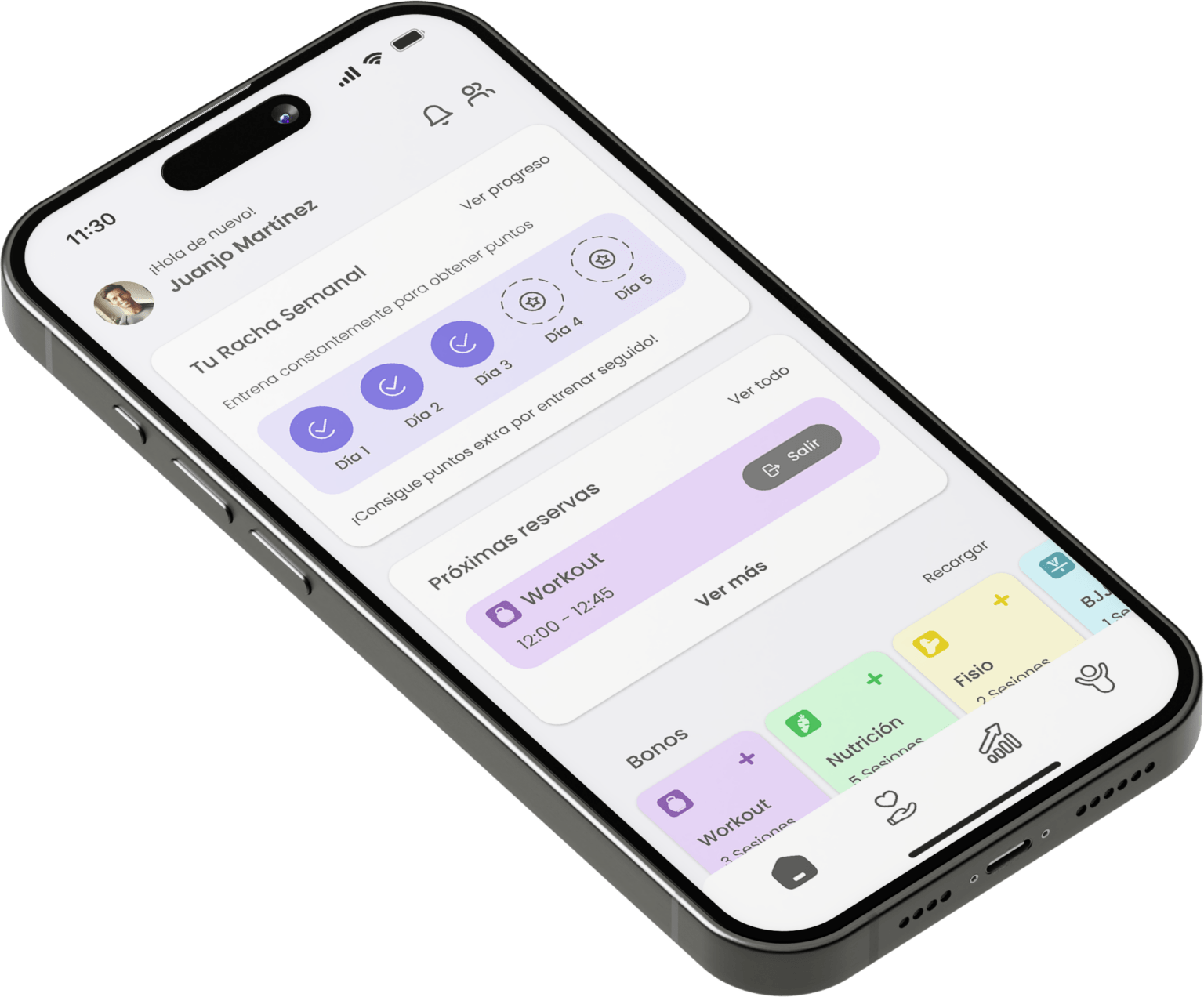
HELIOS APP (Viking Centro App)
A real case describing the process of creating a mobile app for a digital ecosystem designed for comprehensive management of a gym chain, focused on task optimization and time efficiency.
Project category: Mobile app (part of a SaaS project as B2B product)
Function: Exclusive UI/UX & Graphic Designer, Analyst, Researcher and Tester
Field: Booking and Scheduling (MVP) – Fitness & Lifestyle (Growth & Scaling phase)
Tools: Figma, FigJam, Adobe Illustrator, Lucidchart, Zoom
Duration: 20 weeks
Made with cup of tea & empanadilla de atún.
© 2024 Kuba Kobalczyk
Expanding Horizons Through Combination
Product design has diversified in terms of the interface, through research to determine the most concise and cost-effective way to prepare it. (From MVP version to final version’s protoype)
A series of different design methods have been used, such as Modular (Atomic) Design, Service Design, and User-Centered Design. The main purpose of this decision is to balance the most characteristic elements of each method and combine them to create a unique and versatile product for all parties: users, designers, and developers.
Simple and Consistent Navigation
The design is primarily user-oriented, guaranteeing that all functions are accessible, intuitive, and visible to the user at all times, thereby facilitating a seamless and engaging experience.
The decision to integrate a combination of different design methods has been carefully planned and analyzed with a focus on maximizing the visual deployment of information in each section, while also ensuring a consistent and cohesive visual language throughout the app.
The navigation is designed to provide a seamless experience with minimal scrolling.
The Amount of Information Matters
The creation of the app follows some essential details regarding design and programming. There is a lot of data to visualize, many of which are dynamic, so it is important to know what to display at the first level and what to work on in subsequent levels.
It is important to show just the right amount of data to avoid hindering user navigation and, above all, not to overwhelm their attention due to the cognitive load that such information can cause.
From service prices to data on trainers and centers – everything is displayed to maximize user focus and orientation.


HELIOS APP (Viking Centro App)
A real case describing the process of creating a mobile app for a digital ecosystem designed for comprehensive management of a gym chain, focused on task optimization and time efficiency.
Project category: Mobile app (part of a SaaS project as B2B product)
Function: Exclusive UI/UX & Graphic Designer, Analyst, Researcher and Tester
Field: Booking and Scheduling (MVP) – Fitness & Lifestyle (Growth & Scaling phase)
Tools: Figma, FigJam, Adobe Illustrator, Lucidchart, Zoom
Duration: 20 weeks
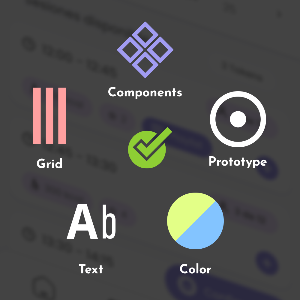
Few features about this project, before you dive in...



Few features about this project, before you dive in...
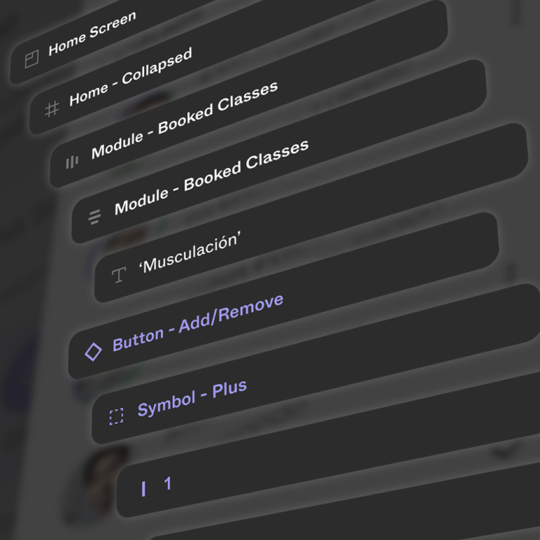

Brief Overview
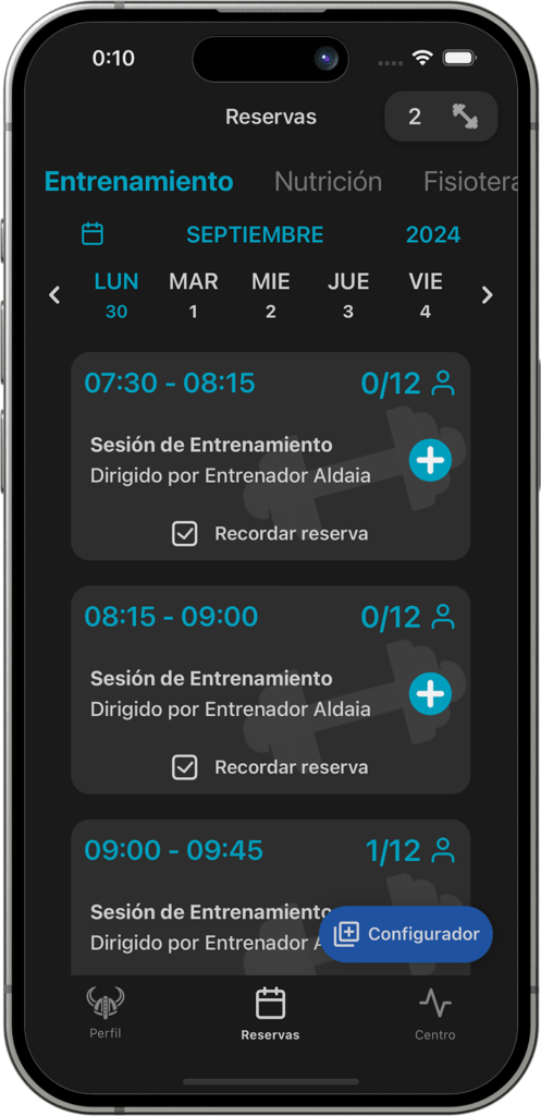
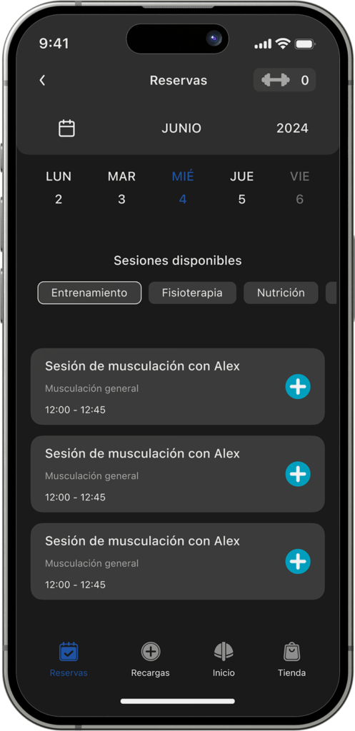
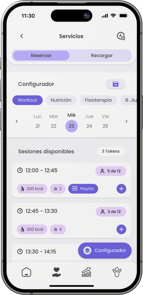
The Viking Centro mobile app is an ambitious project consisting of two parts: user part and administrator/coach part (administrative roles). The tool would mainly be used by users to create an account, book sessions for services or classes of their preference. Additionally, these sessions can also be paid directly through the app.
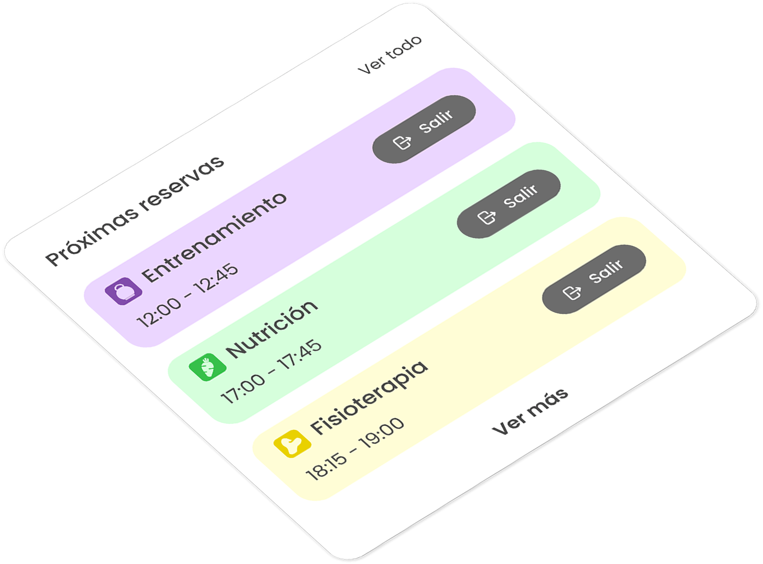
One of many other key functions is the bunch session configurator. Using this feature, users can adjust the quantities and times of their sessions so the product itself can automatically reserve these available slots. Other features include: service filters, reminders, management of invoices or information about the different centers of the Viking Centro gym chain.
The MVP version of the software, as established with the client; will benefit from future changes, including various improvements such as physical activity tracking features, gamification methods and activity logging between users, among others.
Overall Project Goals
The primary goal of the app is to offer an increasingly diverse range of features while focusing on retaining existing customers and providing added value that enhances the business’s offerings.
On the other hand, the goal of the MVP version is to simplify tasks for users, optimize their daily free time, and deliver an easy-to-use interface for it. Additionally, it supports trainers and other specialists by helping them manage appointments and keep track of all their training sessions. A key focus is on resource automation, achieved through integration with a dashboard. This dashboard allows for managing various aspects of the business, such as enabling or disabling app functions, analyzing invoices, and tracking profits for future operations.
The overarching project objective is business growth, with an estimated 25-40% increase in profit within the first year of the apps’ launch.
App Goals
The primary objective of this product is not just to create a mobile app for booking management. Instead, it aims to build a system that can evolve through iterative improvements and feature integrations, ultimately becoming a fully integrated component of a broader ecosystem. This ecosystem is designed to continuously enhance the user experience, driven by feedback from customers, developers, and other stakeholders.
As outlined earlier, the app is being developed in two phases: the MVP version, which has already been launched with essential features, and the feature-complete version. The feature-complete version, currently in development, will introduce advanced features to provide a comprehensive and seamless gym experience.
"It’s not just about creating an app. It’s a process of investigation, analysis, and applying research to deliver a human-centered solution."
"It’s not just about creating an app. It’s a process of investigation, analysis, and applying research to deliver a human-centered solution."
Stages of Development
Please, click on any card to jump to its section
Stages of Development
Please, click on any card to jump to its section
Requirements Gathering
Target Audience
Even though there was already a target audience for the product, it was still necessary to fully understand them. To achieve this, some practical methods were implemented, including User Profiling and Contextual Inquiry.
These two methods have allowed for a deeper understanding of the users’ pain points, their daily situations in which they would use the app, and some other preferences.

Vanesa Rincón Gallardo
- Age: 33
- Gender: Female
- Location: Valencia, Spain
- Occupation: Enterpreneur, Podiatrist
- Education level: Master’s Degree
- Income level: Medium-high (~42.000€)
Biography
Goals & Motivations
- Feel the control and convenience of booking your training session or physiotherapy appointment remotely
- Feel part of your local gym community and connect with other users
- Have all the information organized and displayed in one place, on a digital medium
Pain Points & Frustrations
- She doesn’t like having to call, send instant messages, or go to the gym in person to book her class due to her limited available time and busy daily schedule
- Her motivation decreases when she doesn’t feel progress

Pablo Montoya García
- Age: 42
- Gender: Male
- Location: Zaragoza, Spain
- Occupation: retired urban planner
- Education level: Bachelor’s Degree
- Income level: High (~96.000€)
Biography
Pablo is a retired man who has always had a deep love for nature and animals. After a fulfilling career in urban planning, he now dedicates his time to enjoying the great outdoors and caring for his pets. Pablo finds joy in hiking through forests, birdwatching, and volunteering at local animal shelters. Despite his retirement, Pablo’s days are often busy with various activities and commitments. He sometimes struggles to keep track of his appointments and volunteer shifts, which can be overwhelming. Additionally, Pablo feels anxious about maintaining a healthy lifestyle. He worries about what he should eat and how to exercise effectively. To stay on track, he seeks the guidance of a professional who can help him with nutrition plans and fitness routines.
Goals & Motivations
- Likes to be in constant contact with the people in charge of the activities
- Wants the app to remind you of the attendance to the different activities booked
- Wants to know when your friends are training so that you can socialize with them
Pain Points & Frustrations
- Becomes anxious when some functions are somewhat hidden as it is difficult to reach them
- Feels overwhelmed when an app has too many elements on the screen at once, making navigation confusing and inefficient. (Example given: Aliexpress)
User Interview
A total of 4 people aged between 27 and 43 have been interviewed. The platform used for this process was Zoom. Three groups of questions were developed, covering as many relevant areas as possible for this study.
Technical questions
Referring to experiences with mobile apps.
Navigation within them and what is intended to be made easier through their use.
Fitness/Lifestyle questions
Related to the frequency of physical training, what is most enjoyable during workouts and similar questions.
Personal questions / Experiences
Personal-level questions within the fitness area.
Use of apps to monitor progress, essential tools for every workout, or features that would be useful if digitized or integrated into an app.
All of these questions are focused to:
- Understand their perception of the apps they use, particularly focusing on how easy it is to complete tasks within them.
- Explore their relationship with technology.
- Gauge their level of interest in physical activity.
- Identify their motivations or demotivations.
- Determine what can be improved or created to ensure the product enhances their experience, making them feel it complements their gym-related activities effectively.
Requirements Gathering
Target Audience
Even though there was already a target audience for the product, it was still necessary to fully understand them. To achieve this, some practical methods were implemented, including User Profiling and Contextual Inquiry.
These two methods have allowed for a deeper understanding of the users’ pain points, their daily situations in which they would use the app, and some other preferences.

Vanesa Rincón Gallardo
- Age: 33
- Gender: Female
- Location: Valencia, Spain
- Occupation: Enterpreneur, Podiatrist
- Education level: Master’s Degree
- Income level: Medium-high (~42.000€)
Biography
Vanesa is an ambitious and active person, dedicated to her profession in podology and pleased with the results of her expanding business. She enjoys life in her own way: running in the mornings with her dog and taking cold showers make her feel alive. However, due to her increasing workload, she has less time to manage her personal and professional tasks throughout the day. She would like to optimize her time to be able to dedicate more time to her family and exercise, as she often forgets to book her training class or doesn’t have time to do so because of her work responsibilities. Nevertheless, she also likes to feel that she is making progress day by day in what she does.
Goals & Motivations
- Feel the control and convenience of booking your training session or physiotherapy appointment remotely
- Feel part of your local gym community and connect with other users
- Have all the information organized and displayed in one place, on a digital medium
Pain Points & Frustrations
- She doesn’t like having to call, send instant messages, or go to the gym in person to book her class due to her limited available time and busy daily schedule
- Her motivation decreases when she doesn’t feel progress

Pablo Montoya García
- Age: 42
- Gender: Male
- Location: Zaragoza, Spain
- Occupation: retired urban planner
- Education level: Bachelor’s Degree
- Income level: High (~96.000€)
Biography
Pablo is a retired man who has always had a deep love for nature and animals. After a fulfilling career in urban planning, he now dedicates his time to enjoying the great outdoors and caring for his pets. Pablo finds joy in hiking through forests, birdwatching, and volunteering at local animal shelters. Despite his retirement, Pablo’s days are often busy with various activities and commitments. He sometimes struggles to keep track of his appointments and volunteer shifts, which can be overwhelming. Additionally, Pablo feels anxious about maintaining a healthy lifestyle. He worries about what he should eat and how to exercise effectively. To stay on track, he seeks the guidance of a professional who can help him with nutrition plans and fitness routines.
Goals & Motivations
- Likes to be in constant contact with the people in charge of the activities
- Wants the app to remind you of the attendance to the different activities booked
- Wants to know when your friends are training so that you can socialize with them
Pain Points & Frustrations
- Becomes anxious when some functions are somewhat hidden as it is difficult to reach them
- Feels overwhelmed when an app has too many elements on the screen at once, making navigation confusing and inefficient. (Example given: Aliexpress)
User Interview
A total of 4 people aged between 27 and 43 have been interviewed. The platform used for this process was Zoom. Three groups of questions were developed, covering as many relevant areas as possible for this study.
Personal questions / Experiences
Personal-level questions within the fitness area.
Use of apps to monitor progress, essential tools for every workout, or features that would be useful if digitized or integrated into an app.
Technical questions
Referring to experiences with mobile apps.
Navigation within them and what is intended to be made easier through their use.
Fitness/Lifestyle questions
Related to the frequency of physical training, what is most enjoyable during workouts and similar questions.
All of these questions are focused to:
- Understand their perception of the apps they use, particularly focusing on how easy it is to complete tasks within them.
- Explore their relationship with technology.
- Gauge their level of interest in physical activity.
- Identify their motivations or demotivations.
- Determine what can be improved or created to ensure the product enhances their experience, making them feel it complements their gym-related activities effectively.
"I got injured at work while rearranging some huge boxes. I have a sprain on my left wrist, and I want to keep training, but I’m afraid of making the situation worse."
- Susana
Analysis
Affinity Mapping
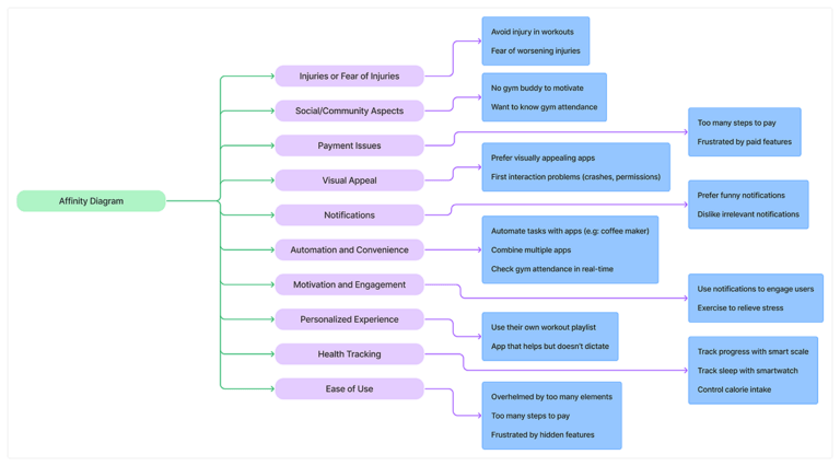
The affinity mapping was a crucial tool for synthesizing user research during this phase. Data from user interviews and other observations were organized into clusters such as: pain points, motivations and needs.
Key insights included users’ frustration with personal situations, their desire for more enjoyable experience, and the importance of timely reminders.
Affinity Diagram with Clusters
Gathered data was processed and displayed on sticky notes on Figjam. From raw data input from each client to assigning a theme to each card.
Then, started to group the notes following different themes and topics they followed such as motivations, feature requests, etc. As the last step, refined clusters were formed after merging notes together and consolidating overlapping data.
Analysis of User Feedback
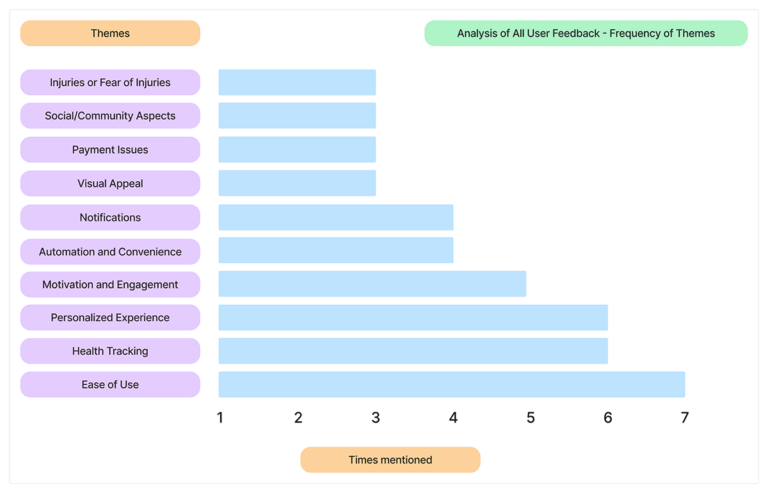
All mentions have been categorized according to the topics they address. In this case, the frequency of mentions regarding certain experiences, desires, or problems expressed by users can be observed.
However, despite some topics being less frequently mentioned, all are taken into consideration for the creation and improvement of the app or apps’ features.
Explore the details — just click on the image!
Check the affinity diagram in it’s schemetized version
User Interview Insights
The purpose of the methods used during user interviews was mainly to understand if the solutions offered in the app are clear and useful for their intended tasks.
Some of the key objectives were:
- Finding out how many users still prefer to book services manually instead of using the app.
- Making the user journey as simple as possible for both easy tasks and more complex ones (example: adding a physical injury).
- Increasing the sense of community by analyzing how users feel about the app’s community features.
What do actual users DO?
Track their metrics, such as sleep duration or weight, through mobile apps
People want to reassure themselves about their choices and see that they are actually making progress
Stay home doing things like watching TV all afternoon or skip the gym entirely because they don’t have workout buddies to go with
Users feel more motivated to work out when they are part of a community or group, or if there is a strong external factor
What do actual users WANT?
Track their calorie expenditure, check how many people are in each session, and share any limitations or injuries that prevent them from performing certain exercises
A.S.D – Advanced Session Detailing. All needed details will be available to check, before booking a class
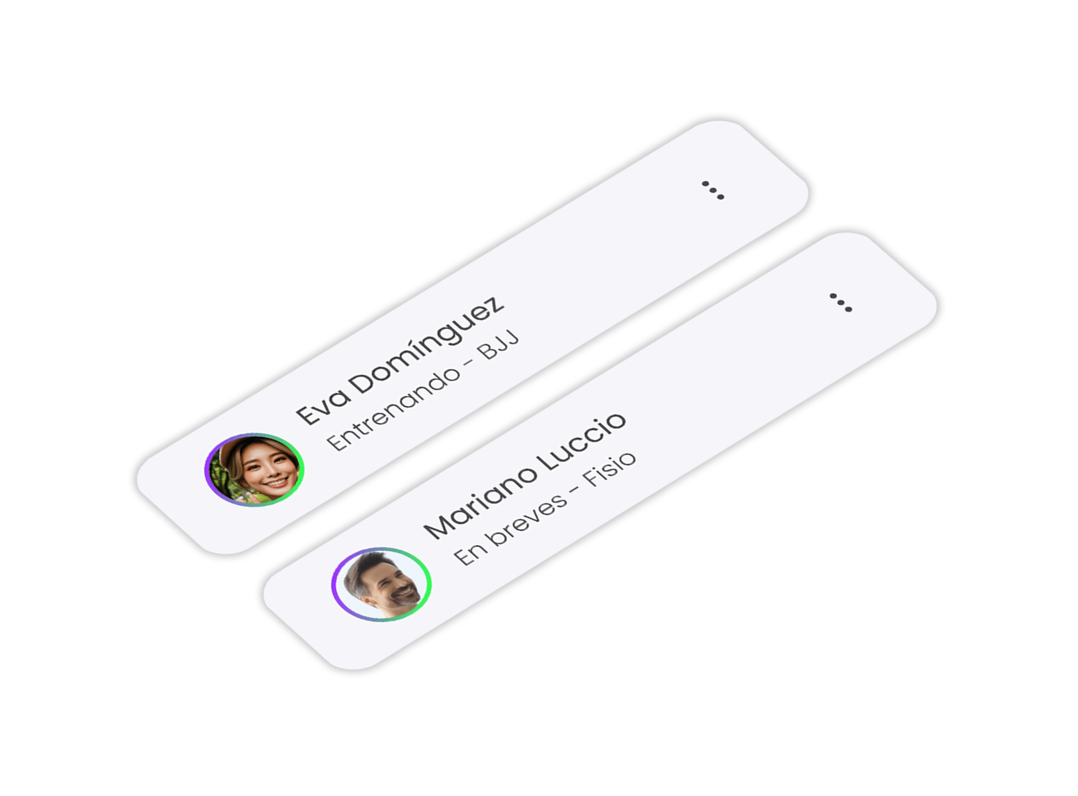
They want to get back in shape and exercise to minimize the aging impact
Nutrition, physical therapy, and personal trainer services, along with health insights provided through the app
Conclusion
We set out to build a reliable, easy-to-use product with features that keep users motivated and excited to work out, while also including health-tracking tools to help improve their lifestyle. One big takeaway is that Spaniards are super social, so we focused on adding social events, group workouts, and fun activities to bring people together.
Prioritizing Solutions
The analysis of the solutions was focused on prioritizing the problems according to their impact on the improvement of the app, taking into account the time that each development would cost. It should be noted that the contractor has already expressed his preferences and which solution is the most urgent, therefore from the delivery of the minimum viable product – the improvements will continue to be incorporated (in the final version) as presented throughout the analysis.
The goal is to guide product development by evaluating the impact and effort of each feature or task, allowing processes to be structured as efficiently and effectively as possible.
Quick Wins
Add adaptability features (e.g. alt text)
Optimize onboarding process (reduce permissions asked at the start)
Low-Hanging Fruit
Automate tasks (gym attendance, reminders, towels)
Offer simple workout stats in the app dashboard
Major Projects
Integrate tracking (weight, calories, progress)
Build a community or social feature (followers’ training status)
Long-Term Investment
Simplify app interface and processes (e.g., payments)
Offer guided workout routines with video tutorials
Analysis
Affinity Mapping
The affinity mapping was a crucial tool for synthesizing user research during this phase. Data from user interviews and other observations were organized into clusters such as: pain points, motivations and needs.
Key insights included users’ frustration with personal situations, their desire for more enjoyable experience, and the importance of timely reminders.
Affinity Diagram with Clusters
Explore the details — just click on the image!
Gathered data was processed and displayed on sticky notes on Figjam. From raw data input from each client to assigning a theme to each card.
Then, started to group the notes following different themes and topics they followed such as motivations, feature requests, etc. As the last step, refined clusters were formed after merging notes together and consolidating overlapping data.
Analysis of User Feedback
Explore the details — just click on the image!
All mentions have been categorized according to the topics they address. In this case, the frequency of mentions regarding certain experiences, desires, or problems expressed by users can be observed.
However, despite some topics being less frequently mentioned, all are taken into consideration for the creation and improvement of the app or apps’ features.
User Interview Insights
The purpose of the methods used during user interviews was mainly to understand if the solutions offered in the app are clear and useful for their intended tasks.
Some of the key objectives were:
- Finding out how many users still prefer to book services manually instead of using the app.
- Making the user journey as simple as possible for both easy tasks and more complex ones (example: adding a physical injury).
- Increasing the sense of community by analyzing how users feel about the app’s community features.
What do actual users DO?
Track their metrics, such as sleep duration or weight, through mobile apps
People want to reassure themselves about their choices and see that they are actually making progress
Stay home doing things like watching TV all afternoon or skip the gym entirely because they don’t have workout buddies to go with
Users feel more motivated to work out when they are part of a community or group, or if there is a strong external factor
What do actual users WANT?
Track their calorie expenditure, check how many people are in each session, and share any limitations or injuries that prevent them from performing certain exercises
A.S.D – Advanced Session Detailing. All needed details will be available to check, before booking a class
They want to get back in shape and exercise to minimize the aging impact
Nutrition, physical therapy, and personal trainer services, along with health insights provided through the app
Conclusion
We set out to build a reliable, easy-to-use product with features that keep users motivated and excited to work out, while also including health-tracking tools to help improve their lifestyle. One big takeaway is that Spaniards are super social, so we focused on adding social events, group workouts, and fun activities to bring people together.
Prioritizing Solutions
The analysis of the solutions was focused on prioritizing the problems according to their impact on the improvement of the app, taking into account the time that each development would cost. It should be noted that the contractor has already expressed his preferences and which solution is the most urgent, therefore from the delivery of the minimum viable product – the improvements will continue to be incorporated (in the final version) as presented throughout the analysis.
The goal is to guide product development by evaluating the impact and effort of each feature or task, allowing processes to be structured as efficiently and effectively as possible.
Quick Wins
Add adaptability features (e.g. alt text)
Optimize onboarding process (reduce permissions asked at the start)
Low-Hanging Fruit
Automate tasks (gym attendance, reminders, towels)
Offer simple workout stats in the app dashboard
Major Projects
Integrate tracking (weight, calories, progress)
Build a community or social feature (followers’ training status)
Long-Term Investment
Simplify app interface and processes (e.g., payments)
Offer guided workout routines with video tutorials
Design
Expanding Horizons Through Combination
Product design has diversified in terms of the interface, through research to determine the most concise and cost-effective way to prepare it. (From MVP version to final version’s protoype)
A series of different design methods have been used, such as Modular (Atomic) Design, Service Design, and User-Centered Design. The main purpose of this decision is to balance the most characteristic elements of each method and combine them to create a unique and versatile product for all parties: users, designers, and developers.
Simple and Consistent Navigation
The design is primarily user-oriented, guaranteeing that all functions are accessible, intuitive, and visible to the user at all times, thereby facilitating a seamless and engaging experience.
The decision to integrate a combination of different design methods has been carefully planned and analyzed with a focus on maximizing the visual deployment of information in each section, while also ensuring a consistent and cohesive visual language throughout the app.
The navigation is designed to provide a seamless experience with minimal scrolling.
The Amount of Information Matters
The creation of the app follows some essential details regarding design and programming. There is a lot of data to visualize, many of which are dynamic, so it is important to know what to display at the first level and what to work on in subsequent levels.
It is important to show just the right amount of data to avoid hindering user navigation and, above all, not to overwhelm their attention due to the cognitive load that such information can cause.
From service prices to data on trainers and centers – everything is displayed to maximize user focus and orientation.
Wireframe Sketches and Inspirations
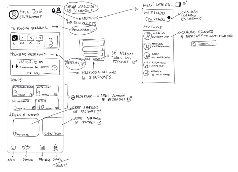
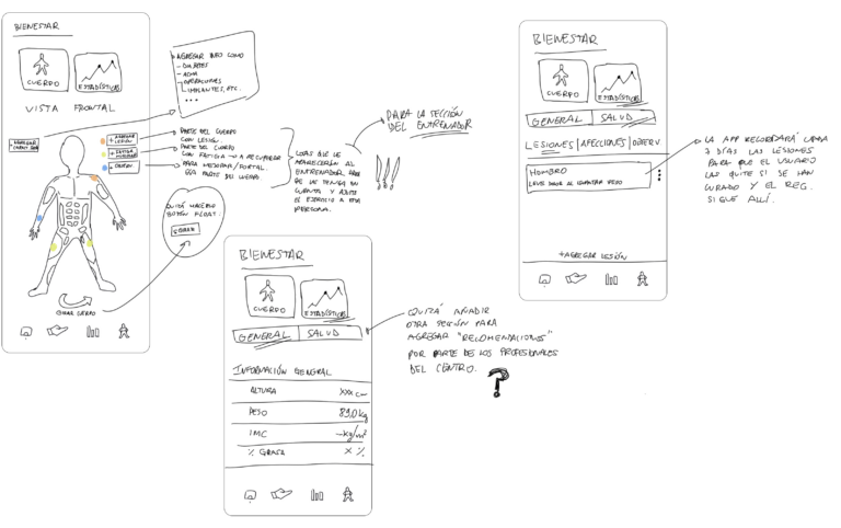
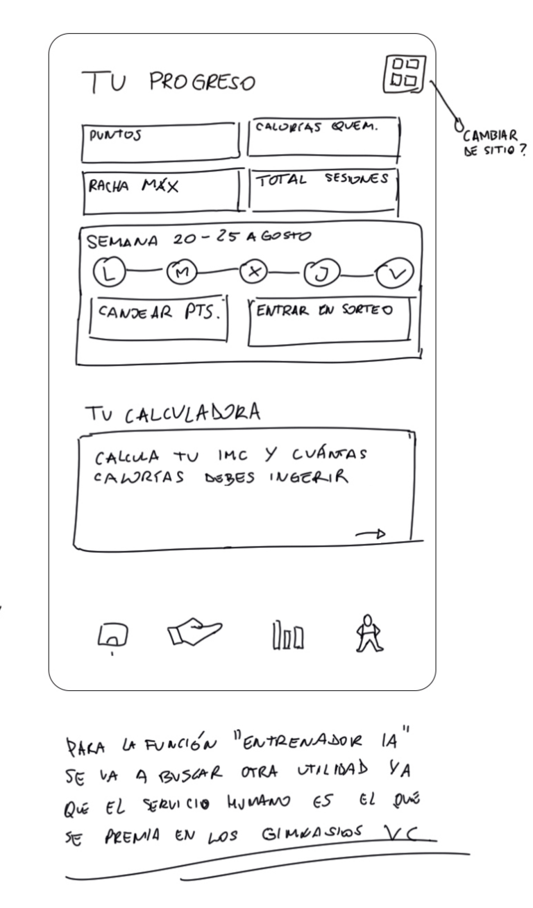
Initially, a series of wireframes were hand-drawn on a digital platform, guided by the sitemap. Most of the elements were retained in the prototype, with only a few minor integrations postponed for later review.
Comparative Analysis
After closely examining numerous published lifestyle, workout, and booking apps, many references were researched and analyzed. The idea is to base product development on impact-effort values in order to structure processes in the best possible way.
Inspiration is understood as any element that adds value to the project. This can include negative aspects that highlight areas for improvement or positive features that can be enhanced, reused, or expanded to make the app more complete and enjoyable for users.
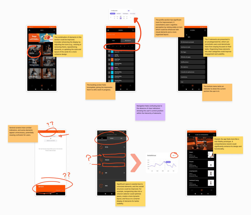
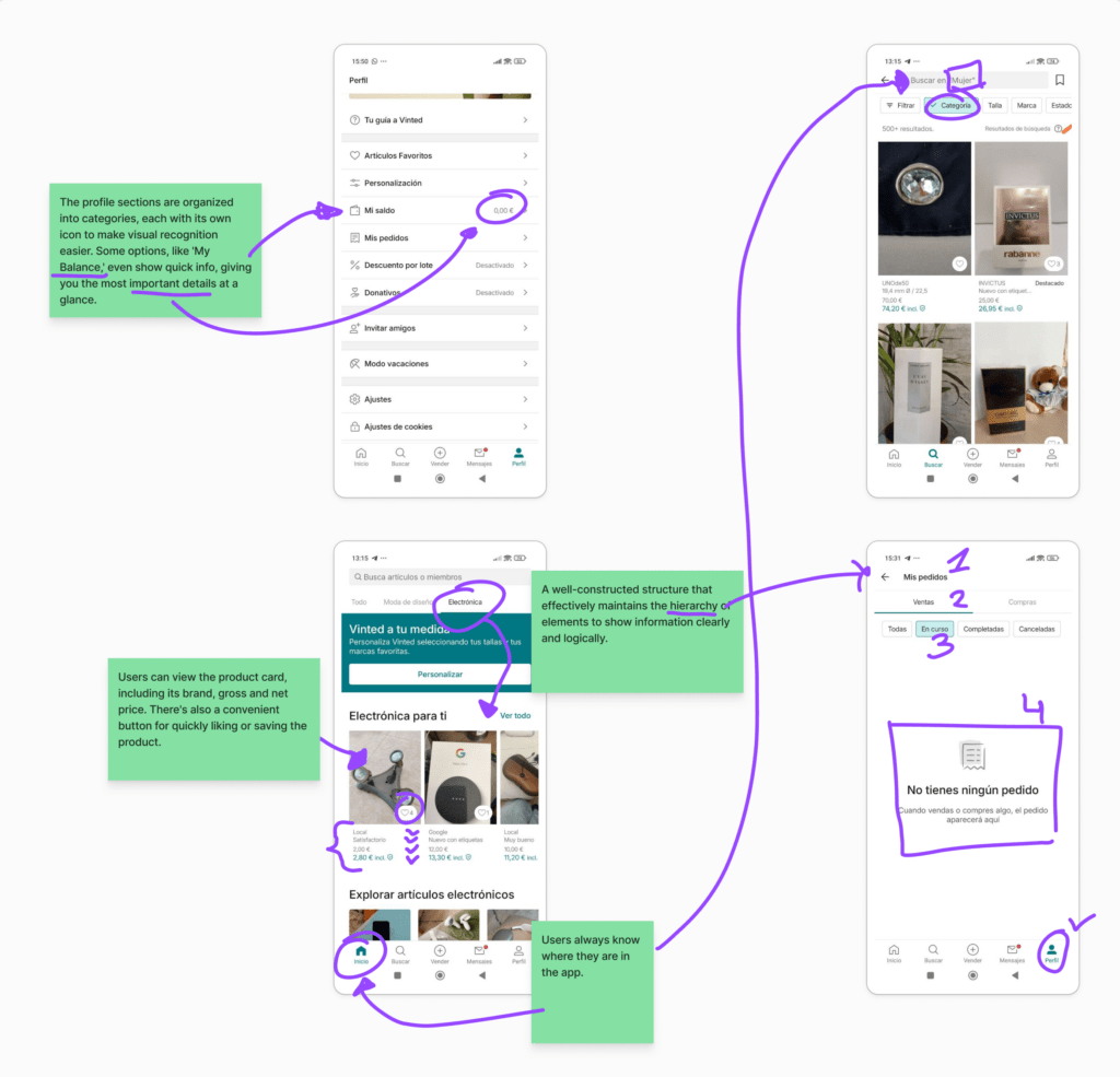
Amongst others, Vivagym mobile app was analyzed, along with some details from the Vinted app, to incorporate certain elements into the Viking Centro prototype. This makes it easier to see which influences were included in the prototype and which were intentionally avoided.
To change and incorporate into the app
Vivagym
BasicFit
Gold's Gym
OG Gym
- There are apps like Vivagym or BasicFit that are only available if you purchase a membership which can be upsetting for users
- Information distribution can be improved, priorizing content spacing and typography choice
- Navigation and hierarchy are chaotic and may make users opt for other apps instead of the franchise’s main one
- Interface design may result outdated
To analyze and incorporate into the app
Vinted
Fitify
- Vinted’s hierarchy throught many filtering options and schemes
- Displaying various information portions throughout small spaces
- Offer chellenges not only about traveled distances but also about famous athletes workouts
Relatively innovative elements in this type of apps
Viking Centro App (HELIOS)
- Contusion Indicator Tool: Note any physical injury that need to be taken in count by the trainer while indicating exercises routines.
- Community Integration: Encourages users to exercise more by earning points, keeping them engaged with leaderboard statistics and bonuses for group workouts. Users commit to consistent exercise by spending their credits on sessions, which also contribute to their point totals.
Conclusion
After analyzing apps like Vivagym and BasicFit, I identified key areas for improvement to enhance our app’s user experience. Offering features for non-members could make the app more inviting, addressing accessibility frustrations. Drawing inspiration from Vinted, filtering options and optimized layouts has been incorporated to better display information, creating a cleaner and more intuitive interface.
Looking ahead, potential features like athlete-inspired challenges or gamified community elements such as leaderboards and group bonuses could deepen engagement. These ideas will require further analysis to ensure alignment with user needs and app goals. By addressing these areas, the app is positioned to deliver a superior user experience and stand out in the fitness market.
From Mid-Fi Screens to a Functional Prototype
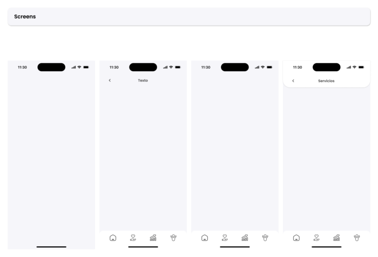
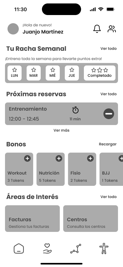
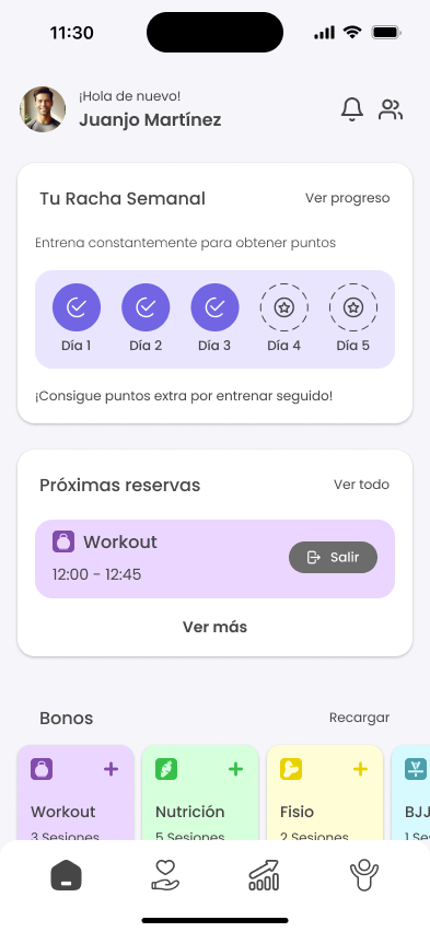
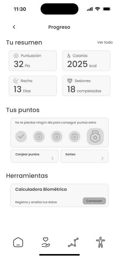
The approach to the interface design, based on feedback provided by gym users, has gone through several phases. The process focused on visualizing information in the most optimal way possible, making the user journey easier and more intuitive.
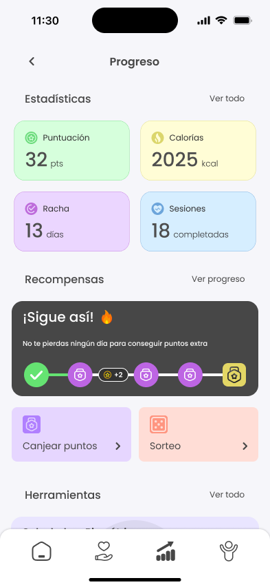
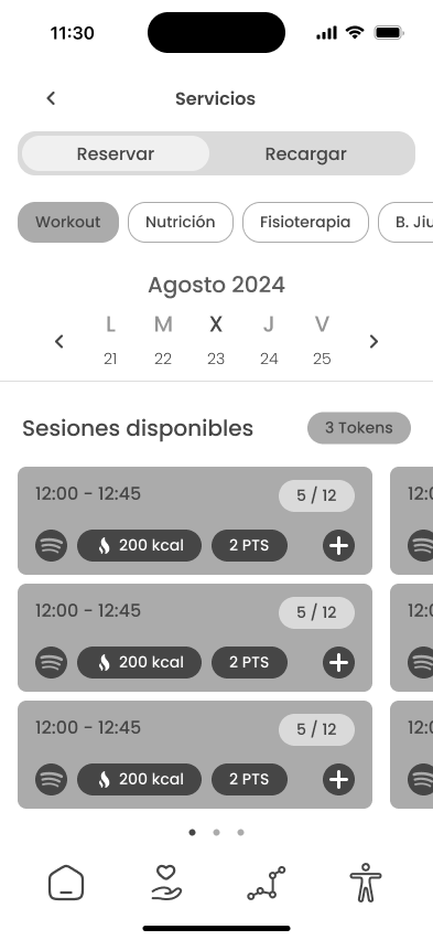
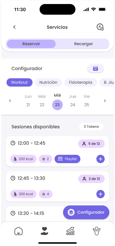
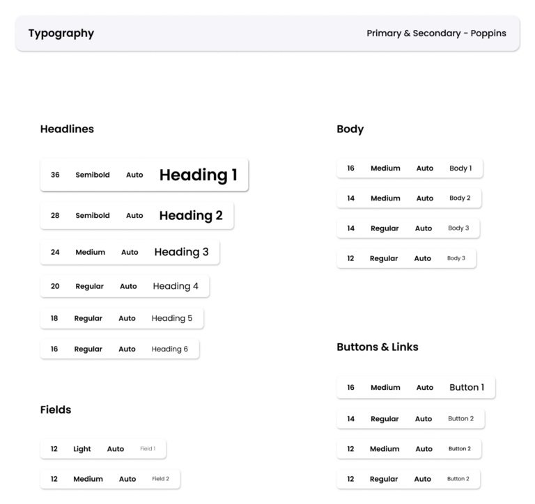
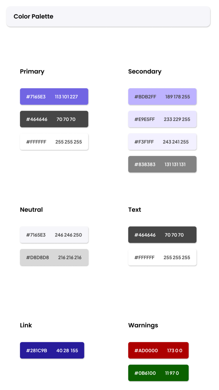
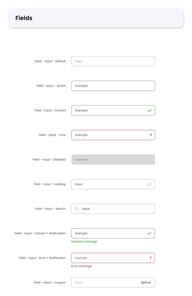
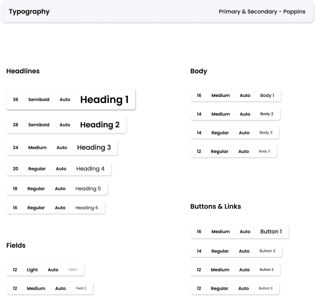
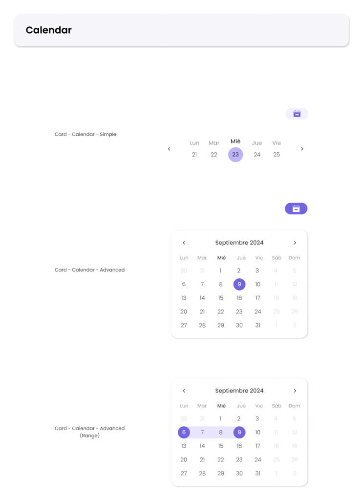
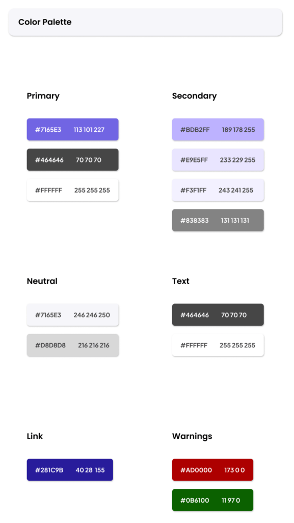
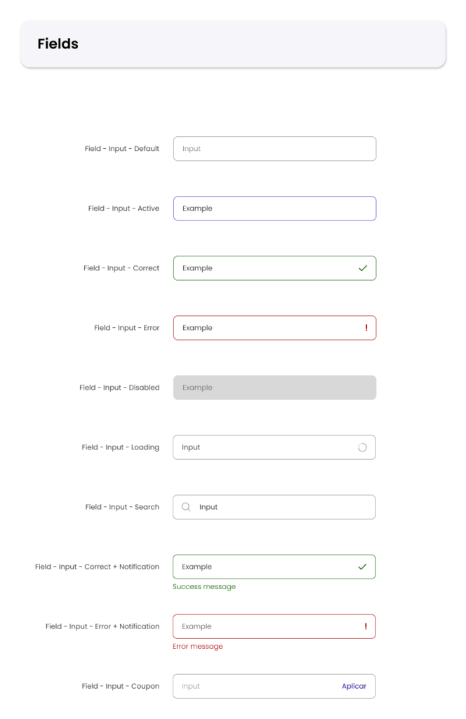
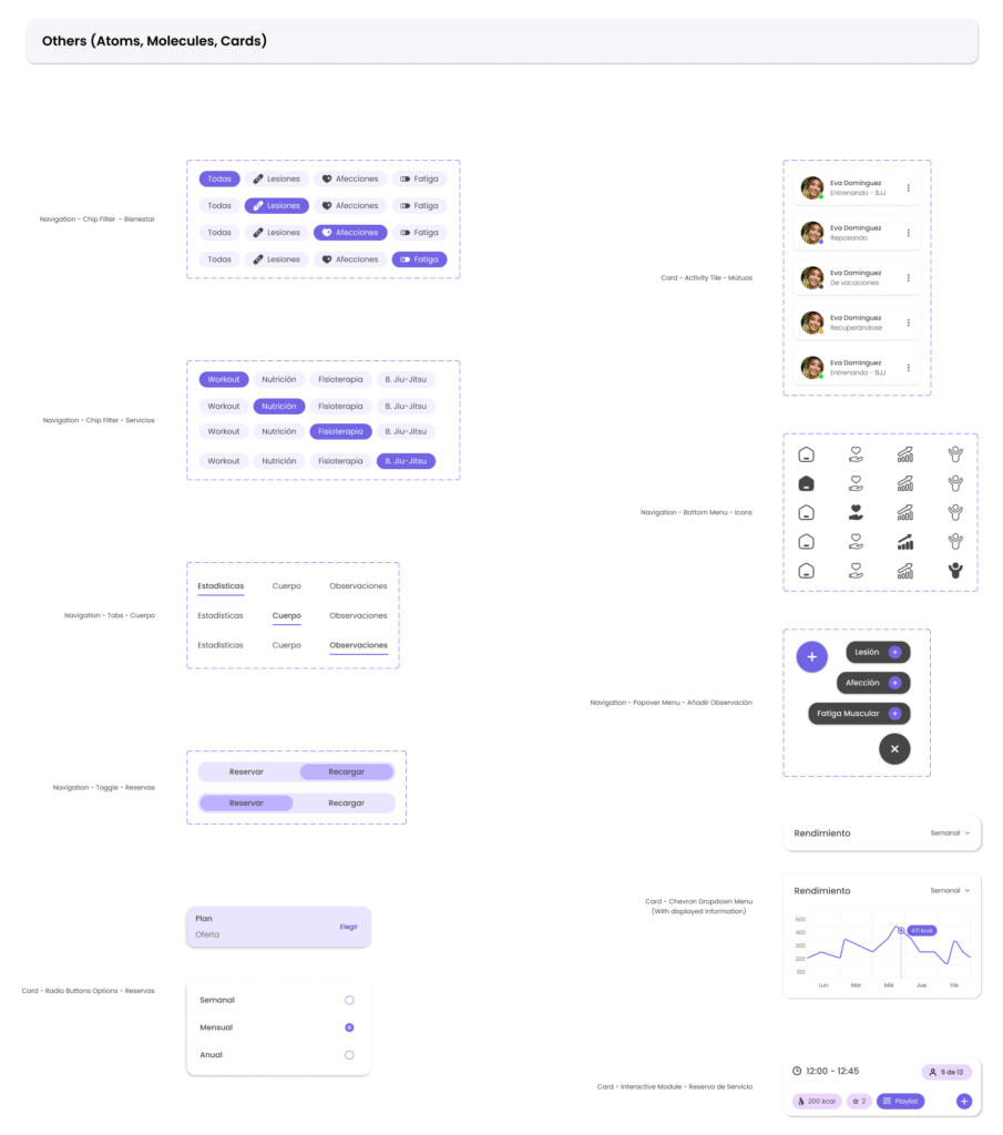
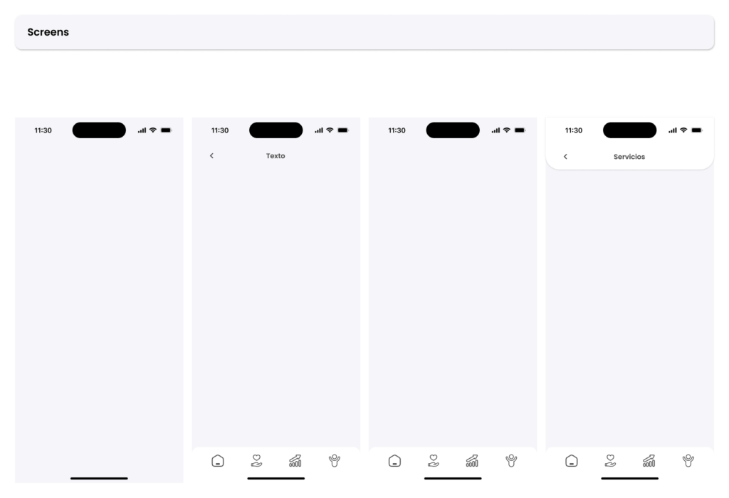
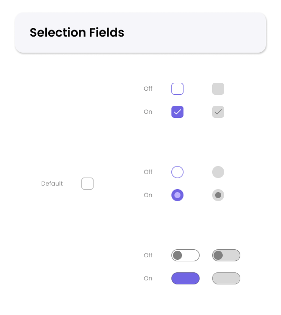
Design System & UI Kit Elements
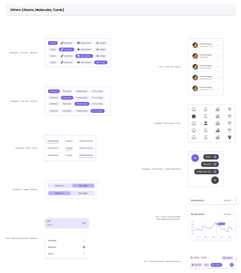
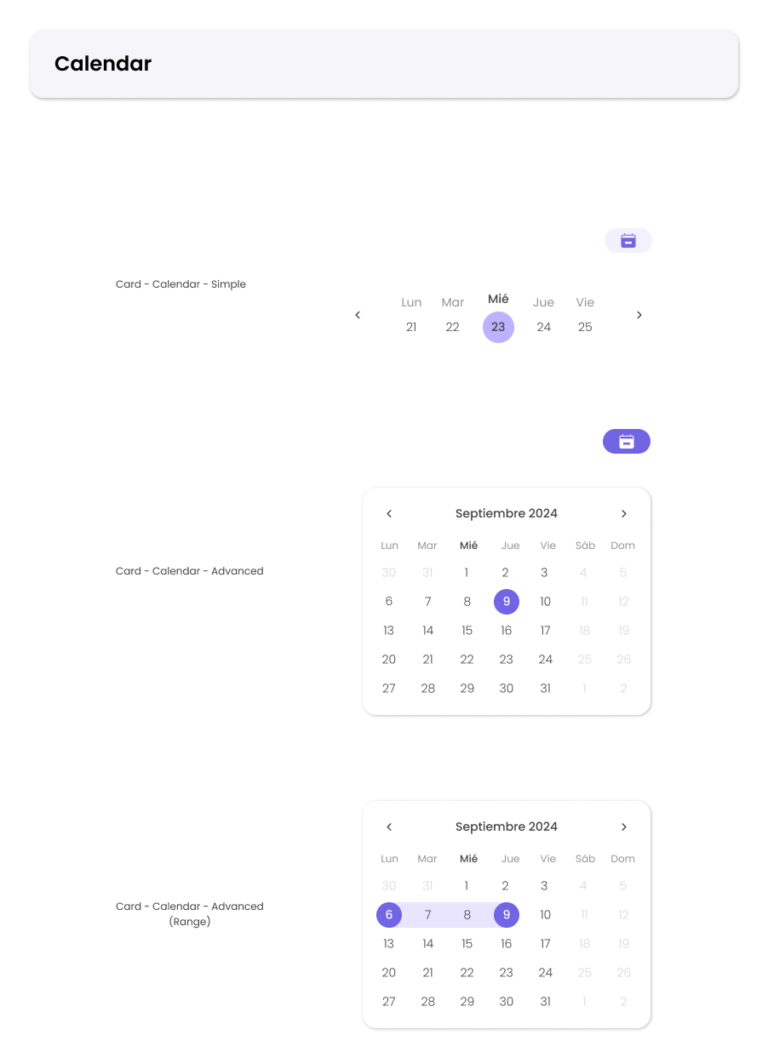
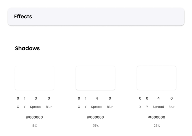
The Design System and UI Kit showcase a cohesive and scalable approach to digital design, including reusable components such as typography, color palettes, buttons and cards.
Built with accessibility and consistency in mind, they streamline workflows and ensure a seamless user experience across the entire product.
Information Architecture
The project has progressed through various phases during the course of its development.
Thanks to its dynamic nature as a constantly evolving product, we have been able to refine the direction of the app within its ecosystem.
How the Structure Works
The sitemap displays a total of three levels of content (subject to future improvements that may expand the number of levels). Key elements or modules indicating information groupings have been highlighted. Additionally, key user interactions in certain sections have been noted to enhance the clarity of the structure. Finally, some functions based on data collection, such as calories burned or points earned, have been specified to visualize which data is displayed in each section.
User's Journey Focus
First, a basic general outline was developed to position the key screens and determine the levels at which they would be placed. Subsequently, additional levels and elements were incorporated to better understand the apps’ functionality based on this outline. One of the main objectives behind this structuring is to focus on displaying the maximum amount of information on the screens, organized into modules in such a way that the user’s attention remains engaged throughout their journey.
Task Flows
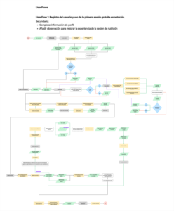
To provide a clearer understanding of the main structure, four examples are included:
- A user journey illustrating the registration process and the use of a free session token, along with secondary paths for completing user profile information and adding observations for the specialist of a booked session.
- Three user flows showcasing additional examples of the app’s functionality and overall navigation.
Cracks in the Blueprint
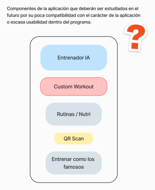
Several elements proposed during the research phases have been partially discarded or their launch postponed due to their interference with the main features of the app. Discarding these elements resulted in slight adjustments to the distribution of features across the screens.
Certain features, such as an AI Trainer or custom routines and workouts, need to be carefully reviewed to ensure alignment with the apps’ value proposition and brand identity. For instance, one of the core features of the app is booking workout sessions led by professional trainers. Adding an AI trainer could potentially undermine this functionality. However, it could be introduced as a complementary feature, offering additional benefits without disrupting the primary service.
Similarly, for features like nutrition plans, these will be incorporated into the app but will not rely on artificial intelligence. To maintain the app’s value proposition, nutrition plans may function as recommendations and personalized diet plans provided by specialists, preserving the human expertise central to the app’s identity.
Design
Expanding Horizons Through Combination
Product design has diversified in terms of the interface, through research to determine the most concise and cost-effective way to prepare it. (From MVP version to final version’s protoype)
A series of different design methods have been used, such as Modular (Atomic) Design, Service Design, and User-Centered Design. The main purpose of this decision is to balance the most characteristic elements of each method and combine them to create a unique and versatile product for all parties: users, designers, and developers.
Simple and Consistent Navigation
The design is primarily user-oriented, guaranteeing that all functions are accessible, intuitive, and visible to the user at all times, thereby facilitating a seamless and engaging experience.
The decision to integrate a combination of different design methods has been carefully planned and analyzed with a focus on maximizing the visual deployment of information in each section, while also ensuring a consistent and cohesive visual language throughout the app.
The navigation is designed to provide a seamless experience with minimal scrolling.
The Amount of Information Matters
The creation of the app follows some essential details regarding design and programming. There is a lot of data to visualize, many of which are dynamic, so it is important to know what to display at the first level and what to work on in subsequent levels.
It is important to show just the right amount of data to avoid hindering user navigation and, above all, not to overwhelm their attention due to the cognitive load that such information can cause.
From service prices to data on trainers and centers – everything is displayed to maximize user focus and orientation.
Wireframe Sketches and Inspirations
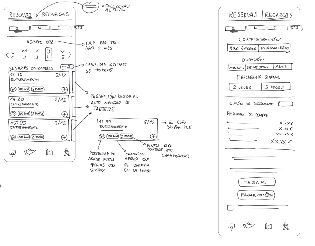
Initially, a series of wireframes were hand-drawn on a digital platform, guided by the sitemap. Most of the elements were retained in the prototype, with only a few minor integrations postponed for later review.
Click on any image to enlarge


Comparative Analysis
After closely examining numerous published lifestyle, workout, and booking apps, many references were researched and analyzed. The idea is to base product development on impact-effort values in order to structure processes in the best possible way.
Inspiration is understood as any element that adds value to the project. This can include negative aspects that highlight areas for improvement or positive features that can be enhanced, reused, or expanded to make the app more complete and enjoyable for users.
Amongst others, Vivagym mobile app was analyzed, along with some details from the Vinted app, to incorporate certain elements into the Viking Centro prototype. This makes it easier to see which influences were included in the prototype and which were intentionally avoided.
Click on any image to enlarge


A total of five apps have been analyzed. From similar apps throught fitness & lifestyle category, to products like Vinted (used accessories and garment market) – as inspiration for both: content and functions.
To change and incorporate into the app
Analyzed apps: Vivagym, BasicFit, Gold’s Gym, OG Gym
- There are apps like Vivagym or BasicFit that are only available if you purchase a membership which can be upsetting for users
- Information distribution can be improved, priorizing content spacing and typography choice
- Navigation and hierarchy are chaotic and may make users opt for other apps instead of the franchise’s main one
- Interface design may result outdated
To analyze and incorporate into the app
Analyzed apps: Vinted, Fitify
- Vinted’s hierarchy throught many filtering options and schemes
- Displaying various information portions throughout small spaces
- Offer chellenges not only about traveled distances but also about famous athletes workouts
Relatively innovative elements in this type of apps
Analyzed: Viking Centro App (HELIOS) Prototype
- Contusion Indicator Tool: Note any physical injury that need to be taken in count by the trainer while indicating exercises routines.
- Community Integration: Encourages users to exercise more by earning points, keeping them engaged with leaderboard statistics and bonuses for group workouts. Users commit to consistent exercise by spending their credits on sessions, which also contribute to their point totals.
Conclusion
After analyzing apps like Vivagym and BasicFit, I identified key areas for improvement to enhance our app’s user experience. Offering features for non-members could make the app more inviting, addressing accessibility frustrations. Drawing inspiration from Vinted, filtering options and optimized layouts has been incorporated to better display information, creating a cleaner and more intuitive interface.
Looking ahead, potential features like athlete-inspired challenges or gamified community elements such as leaderboards and group bonuses could deepen engagement. These ideas will require further analysis to ensure alignment with user needs and app goals. By addressing these areas, the app is positioned to deliver a superior user experience and stand out in the fitness market.
From Mid-Fi Screens to a Functional Prototype
The approach to the interface design, based on feedback provided by gym users, has gone through several phases. The process focused on visualizing information in the most optimal way possible, making the user journey easier and more intuitive.


Design System & UI Kit Elements
The Design System and UI Kit showcase a cohesive and scalable approach to digital design, including reusable components such as typography, color palettes, buttons and cards.
Built with accessibility and consistency in mind, they streamline workflows and ensure a seamless user experience across the entire product.

Information Architecture
The project has progressed through various phases during the course of its development.
Thanks to its dynamic nature as a constantly evolving product, we have been able to refine the direction of the app within its ecosystem.
How the Structure Works
The sitemap displays a total of three levels of content (subject to future improvements that may expand the number of levels). Key elements or modules indicating information groupings have been highlighted. Additionally, key user interactions in certain sections have been noted to enhance the clarity of the structure. Finally, some functions based on data collection, such as calories burned or points earned, have been specified to visualize which data is displayed in each section.
User's Journey Focus
First, a basic general outline was developed to position the key screens and determine the levels at which they would be placed. Subsequently, additional levels and elements were incorporated to better understand the apps’ functionality based on this outline. One of the main objectives behind this structuring is to focus on displaying the maximum amount of information on the screens, organized into modules in such a way that the user’s attention remains engaged throughout their journey.
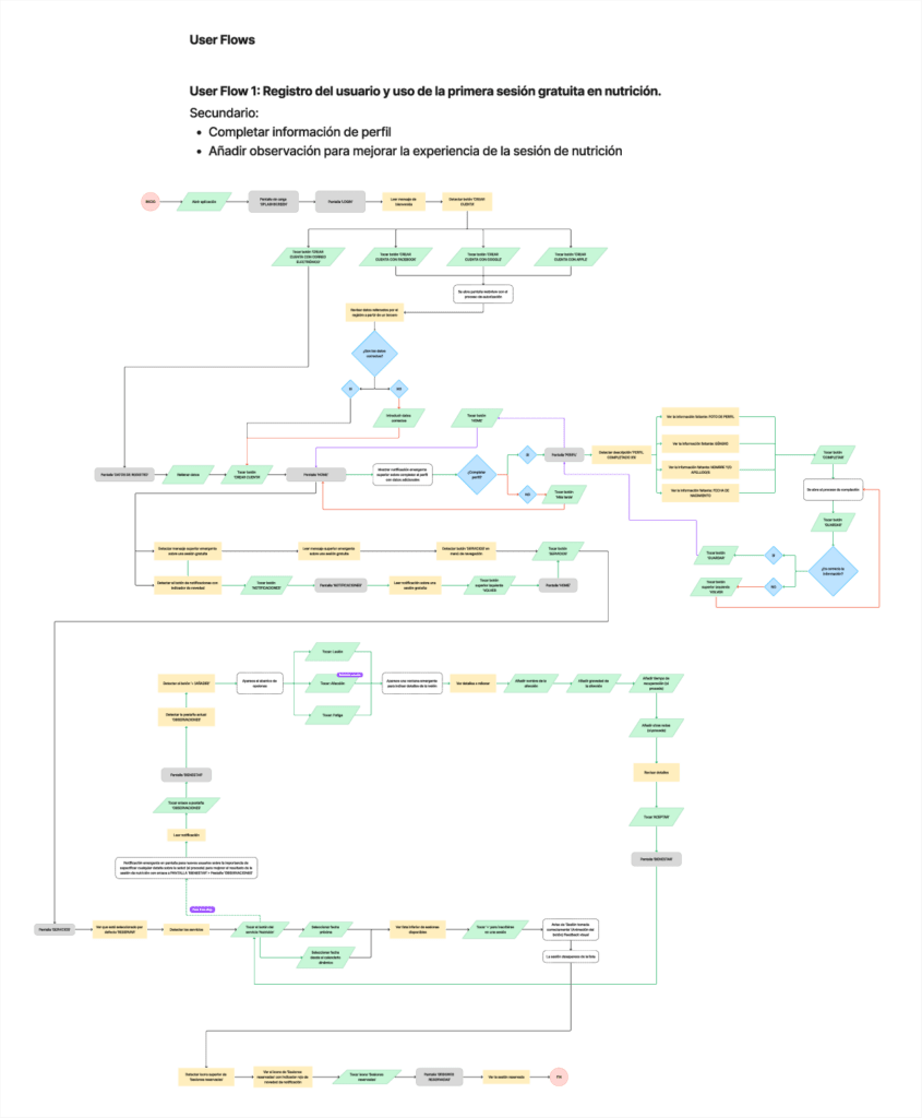
Task Flows
To provide a clearer understanding of the main structure, four examples are included:
- A user journey illustrating the registration process and the use of a free session token, along with secondary paths for completing user profile information and adding observations for the specialist of a booked session.
- Three user flows showcasing additional examples of the app’s functionality and overall navigation.
Cracks in the Blueprint
Several elements proposed during the research phases have been partially discarded or their launch postponed due to their interference with the main features of the app. Discarding these elements resulted in slight adjustments to the distribution of features across the screens.
Certain features, such as an AI Trainer or custom routines and workouts, need to be carefully reviewed to ensure alignment with the apps’ value proposition and brand identity. For instance, one of the core features of the app is booking workout sessions led by professional trainers. Adding an AI trainer could potentially undermine this functionality. However, it could be introduced as a complementary feature, offering additional benefits without disrupting the primary service.
Similarly, for features like nutrition plans, these will be incorporated into the app but will not rely on artificial intelligence. To maintain the app’s value proposition, nutrition plans may function as recommendations and personalized diet plans provided by specialists, preserving the human expertise central to the app’s identity.

Development
Frontend & Backend as a Key for MVP
Although sufficient information was available to guide development, the nature of the app and its methodology required defining the point at which it could be considered a minimum viable product (MVP).
By combining strategies from the MVP Canvas and Lean UX methodologies, we determined the exact point to deliver a basic yet robust product that addresses the primary needs of clients while ensuring a clear and enjoyable user journey.
Easy to Update - Easy to Maintain
Thanks to the coder’s expertise, we were able to develop an organized product that effectively meets the needs of the gym’s clients. However, the cornerstone of the project is its focus on continuous improvement, driven by feedback from stakeholders.
With its thoughtful design, compatibility with both Android and iOS platforms, and responsiveness, the app allows for flexible updates to security, design, or content at any time without compromising platform stability or consistency.
Development
Frontend and Backend: Key to Achieve the MVP
Although sufficient information was available to guide development, the nature of the app and its methodology required defining the point at which it could be considered a minimum viable product (MVP).
By combining strategies from the MVP Canvas and Lean UX methodologies, we determined the exact point to deliver a basic yet robust product that addresses the primary needs of clients while ensuring a clear and enjoyable user journey.
Easy to Update - Easy to Maintain
Thanks to the coder’s expertise, we were able to develop an organized product that effectively meets the needs of the gym’s clients. However, the cornerstone of the project is its focus on continuous improvement, driven by feedback from stakeholders.
With its thoughtful design, compatibility with both Android and iOS platforms, and responsiveness, the app allows for flexible updates to security, design, or content at any time without compromising platform stability or consistency.
Testing & Quality Assurance
Minimizing Cognitive Load
Throughout the user journey, the focus is on delivering a clean and intuitive experience, ensuring users do not feel anxious or lost.
Using techniques such as Unmoderated Remote Testing, among others, most of the selected users (87%) successfully performed the planned actions for various end goals, leading to the app being defined as:
‘perfect for the purposes for which it is intended’
Less Errors - More Satisfaction
Functionality and usability tests were conducted with real users, gathering valuable feedback through studies that helped address and resolve various issues.
Additionally, the apps’ connections were thoroughly tested and verified to ensure the highest level of security for transactions and customer data. This approach not only enhances user trust in our platform but also fosters a sense of understanding and loyalty, ultimately increasing the likelihood of closing sales.
Testing & Quality Assurance
Less Errors - More Satisfaction
Functionality and usability tests were conducted with real users, gathering valuable feedback through studies that helped address and resolve various issues.
Additionally, the apps’ connections were thoroughly tested and verified to ensure the highest level of security for transactions and customer data. This approach not only enhances user trust in our platform but also fosters a sense of understanding and loyalty, ultimately increasing the likelihood of closing sales.
Minimal Cognitive Load
Throughout the user journey, the focus is on delivering a clean and intuitive experience, ensuring users do not feel anxious or lost.
Using techniques such as Unmoderated Remote Testing, among others, most of the selected users (87%) successfully performed the planned actions for various end goals, leading to the app being defined as:
‘perfect for the purposes for which it is intended’
Deployment
Focusing on CI/CD
Establishing an effective and balanced workflow for implementing improvements and changes to the user experience and interfaces is essential for maintaining a dynamic and evolving app.
To achieve this, a series of gradual implementations have been defined, allowing improvements to be integrated as the design system is updated or new features are tested, all while minimizing unnecessary risks.
Monitoring and Logging Activities
Using methods such as Session Recordings and User Interaction Tracking, we can analyze how users navigate the app and identify potential pain points.
Based on this data, corrective actions are determined by reviewing technical log files, where all relevant information is recorded.
Maintenance & Support
Continous Feedback
The launch of the app marks just the beginning of its lifecycle. User feedback, complaints, suggestions, and inquiries must be collected, analyzed, and acted upon to ensure continuous improvement.
To facilitate this, feedback channels have been integrated directly into the app, alongside traditional methods such as email and forms.
The Iterativeness of User Experience
User experience is a continually evolving aspect of design that can never be fully researched, developed, or optimized—especially for apps like the Viking Centro App.
Achieving ‘perfection‘ from start to finish is a challenge. While some strategies prove effective, others may be better suited to different types of projects. Therefore, there is a strong commitment to continually refining the approaches, strategies, and methods used in user experience and interface design.
The scope of this project provides a platform for expressing ideas and transforming them into digitally tangible solutions that meet the needs and expectations of users.
Maintenance & Support
The Iterativeness of User Experience
User experience is a continually evolving aspect of design that can never be fully researched, developed, or optimized—especially for apps like the Viking Centro App.
Achieving ‘perfection‘ from start to finish is a challenge. While some strategies prove effective, others may be better suited to different types of projects. Therefore, there is a strong commitment to continually refining the approaches, strategies, and methods used in user experience and interface design.
The scope of this project provides a platform for expressing ideas and transforming them into digitally tangible solutions that meet the needs and expectations of users.
Continous Feedback
The launch of the app marks just the beginning of its lifecycle. User feedback, complaints, suggestions, and inquiries must be collected, analyzed, and acted upon to ensure continuous improvement.
To facilitate this, feedback channels have been integrated directly into the app, alongside traditional methods such as email and forms.
Maintenance & Support
Why this Project was so important for me as a Product Designer?
The Viking Centro app project and the subsequent development of a more comprehensive version, aiming to become a commercial software solution for fitness businesses and gyms, has been an incredibly enriching experience. It taught me countless lessons about the processes of analysis, research, design, and development.
Working closely alongside my associate, who did an outstanding job with the programming, highlighted how much can be achieved through effective communication. It also revealed how differently design and programming perspectives can approach the same task, underscoring the importance of collaboration.
We maintained continuous communication to manage the constant changes requested by stakeholders. Every change was carefully discussed to determine its feasibility in terms of both design and coding, and whether it could be implemented in future versions of the app.
To streamline the process, we established several workflows to maintain control over the entire project. Calls, meetings, and other activities related to the app’s development were scheduled and carried out diligently. Interactions with stakeholders and clients were invaluable in guiding the project and making informed decisions.
While there are many aspects to refine and adapt in future versions of the app, we are actively working on updates and fixes to provide the best possible service. Although the current MVP version is understandably far from the envisioned final product, it serves as a solid foundation for continuous improvement and growth.
Greatest Lessons Learned
We made significant progress in understanding how software development works in the real world. One of our key tasks was creating a guide for stakeholders, allowing them to clearly outline what they wanted to add to the app. This approach enabled us to analyze requests, establish timelines and costs, and maintain transparent communication with all parties involved in the process.
At the beginning, we were unsure about pricing for many of the features we developed. To address this, we created a comprehensive pricing guide for app development. This guide is based on thorough research and analysis of various information sources, ensuring we offer fair and accurate pricing tailored to the scope of each development project.
Additionally, we had to dive deep into the policies of digital distribution platforms like Google Play and the App Store. Ensuring the Viking Centro app met the requirements of both platforms proved to be a challenging task at times, but one we successfully navigated.
From developing algorithms to integrating third-party apps and functionalities, and from creating a design system to structuring information hierarchically while respecting the app’s code architecture, we overcame numerous challenges.
We are proud to say that, despite starting from scratch, we successfully published a functional and robust app.
Key Takeaways
Why this Project was so Important for me as a Product Designer?
The Viking Centro app project and the subsequent development of a more comprehensive version, aiming to become a commercial software solution for fitness businesses and gyms, has been an incredibly enriching experience. It taught me countless lessons about the processes of analysis, research, design, and development.
Working closely alongside my associate, who did an outstanding job with the programming, highlighted how much can be achieved through effective communication. It also revealed how differently design and programming perspectives can approach the same task, underscoring the importance of collaboration.
We maintained continuous communication to manage the constant changes requested by stakeholders. Every change was carefully discussed to determine its feasibility in terms of both design and coding, and whether it could be implemented in future versions of the app.
To streamline the process, we established several workflows to maintain control over the entire project. Calls, meetings, and other activities related to the app’s development were scheduled and carried out diligently. Interactions with stakeholders and clients were invaluable in guiding the project and making informed decisions.
While there are many aspects to refine and adapt in future versions of the app, we are actively working on updates and fixes to provide the best possible service. Although the current MVP version is understandably far from the envisioned final product, it serves as a solid foundation for continuous improvement and growth.
Greatest Lessons Learned
We made significant progress in understanding how software development works in the real world. One of our key tasks was creating a guide for stakeholders, allowing them to clearly outline what they wanted to add to the app. This approach enabled us to analyze requests, establish timelines and costs, and maintain transparent communication with all parties involved in the process.
At the beginning, we were unsure about pricing for many of the features we developed. To address this, we created a comprehensive pricing guide for app development. This guide is based on thorough research and analysis of various information sources, ensuring we offer fair and accurate pricing tailored to the scope of each development project.
Additionally, we had to dive deep into the policies of digital distribution platforms like Google Play and the App Store. Ensuring the Viking Centro app met the requirements of both platforms proved to be a challenging task at times, but one we successfully navigated.
From developing algorithms to integrating third-party apps and functionalities, and from creating a design system to structuring information hierarchically while respecting the app’s code architecture, we overcame numerous challenges.
We are proud to say that, despite starting from scratch, we successfully published a functional and robust app.
The only thing we don't get back is time ⌚
...and I want to thank you by spending it on checking my work! 🙂
Do you like what you see?
🧩 Let’s connect!
Made with cup of tea & empanadilla de atún.
© 2024 Kuba Kobalczyk
Made with cup of tea & empanadilla de atún.
© 2024 Kuba Kobalczyk
