Viking Centro App (HELIOS)
A real case describing the process of creating a mobile app for a digital ecosystem designed for comprehensive management of a gym chain, focused on task optimization and time efficiency.
Project category: Mobile app (part of a SaaS project as B2B product)
Function: Exclusive UI/UX & Graphic Designer, Analyst, Researcher and Tester
Field: Booking and Scheduling (MVP) – Fitness & Lifestyle (Growth & Scaling phase)
Tools: Figma, FigJam, Adobe Illustrator, Lucidchart, Zoom
Duration: 20 weeks
Client
Viking Centro
Type
Product Design
Year
2023-2024

Caring about structure
File's layers consistently renamed.

Components as automation
Component management and advanced prototyping.

Caring about accessibility
W3C Accessibility Guidelines Color Contrast Compliant.
Caring about structure
File's layers consistently renamed.
Components as automation
Component management and advanced prototyping.
Caring about accessibility
W3C Accessibility Guidelines Color Contrast Compliant.
Caring about structure
File's layers consistently renamed.
Components as automation
Component management and advanced prototyping.
Caring about accessibility
W3C Accessibility Guidelines Color Contrast Compliant.
Caring about structure
File's layers consistently renamed.
Components as automation
Component management and advanced prototyping.
Caring about accessibility
W3C Accessibility Guidelines Color Contrast Compliant.
Caring about structure
File's layers consistently renamed.
Components as automation
Component management and advanced prototyping.
Caring about accessibility
W3C Accessibility Guidelines Color Contrast Compliant.
Caring about structure
File's layers consistently renamed.
Components as automation
Component management and advanced prototyping.
Caring about accessibility
W3C Accessibility Guidelines Color Contrast Compliant.
Caring about structure
File's layers consistently renamed.
Components as automation
Component management and advanced prototyping.
Caring about accessibility
W3C Accessibility Guidelines Color Contrast Compliant.
Caring about structure
File's layers consistently renamed.
Components as automation
Component management and advanced prototyping.
Caring about accessibility
W3C Accessibility Guidelines Color Contrast Compliant.
Brief Overview
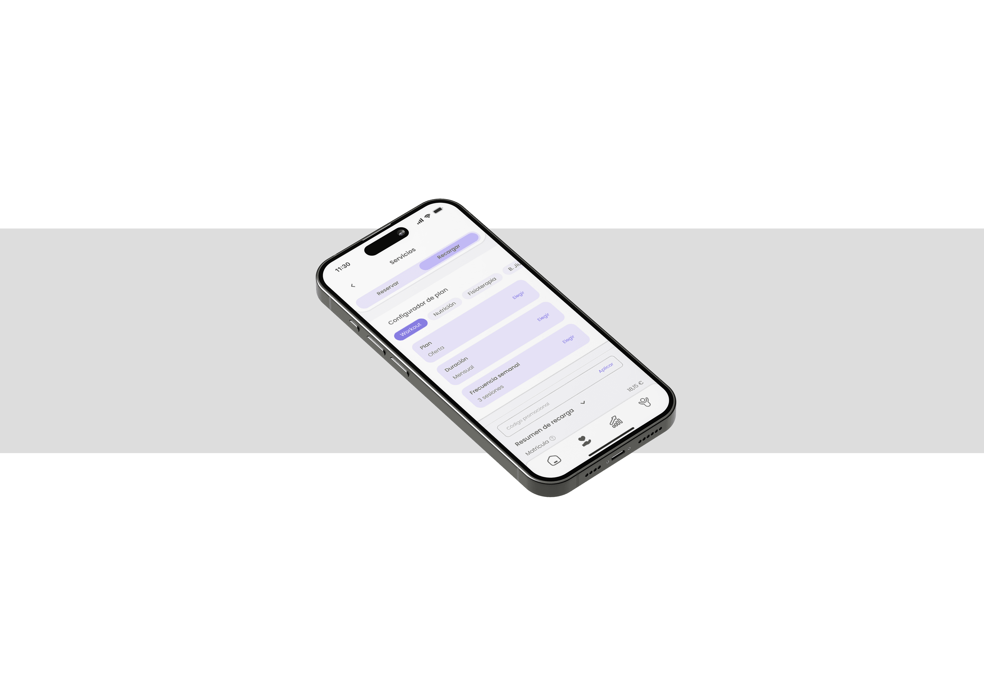
The Viking Centro mobile app is an ambitious project consisting of two parts: user part and administrator/coach part (administrative roles). The tool would mainly be used by users to create an account, book sessions for services or classes of their preference. Additionally, these sessions can also be paid directly through the app.
One of many other key functions is the bunch session configurator. Using this feature, users can adjust the quantities and times of their sessions so the product itself can automatically reserve these available slots. Other features include: service filters, reminders, management of invoices or information about the different centers of the Viking Centro gym chain.
The MVP version of the software, as established with the client; will benefit from future changes, including various improvements such as physical activity tracking features, gamification methods and activity logging between users, among others.
Main Project Goals
The primary goal of the app is to offer an increasingly diverse range of features while focusing on retaining existing customers and providing added value that enhances the business’s offerings.
On the other hand, the goal of the MVP version is to simplify tasks for users, optimize their daily free time, and deliver an easy-to-use interface for it. Additionally, it supports trainers and other specialists by helping them manage appointments and keep track of all their training sessions. A key focus is on resource automation, achieved through integration with a dashboard. This dashboard allows for managing various aspects of the business, such as enabling or disabling app functions, analyzing invoices, and tracking profits for future operations.
The overarching project objective is business growth, with an estimated 25-40% increase in profit within the first year of the apps’ launch.
App Goals
The primary objective of this product is not just to create a mobile app for booking management. Instead, it aims to build a system that can evolve through iterative improvements and feature integrations, ultimately becoming a fully integrated component of a broader ecosystem. This ecosystem is designed to continuously enhance the user experience, driven by feedback from customers, developers, and other stakeholders.
As outlined earlier, the app is being developed in two phases: the MVP version, which has already been launched with essential features, and the feature-complete version. The feature-complete version, currently in development, will introduce advanced features to provide a comprehensive and seamless gym experience.
Investigation

Analysis

Enhancement

Requirements Gathering
Target Audience
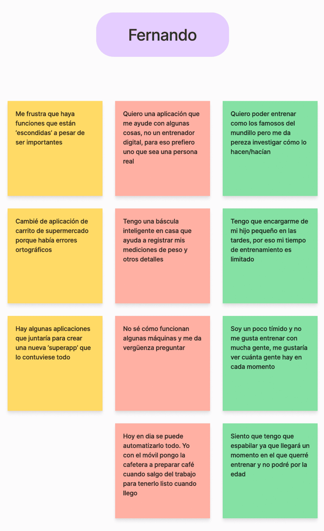
Even though there was already a target audience for the product, it was still necessary to fully understand them. To achieve this, some practical methods were implemented, including User Profiling and Contextual Inquiry.
These two methods have allowed for a deeper understanding of the users’ pain points, their daily situations in which they would use the app, and some other preferences.

Pablo Montoya García
Age: 42
Gender: Male
Location: Zaragoza, Spain
Occupation: retired urban planner
Education level: Bachelor’s Degree
Income level: High (~96.000€)
Frequently-used Apps
01
Biography
01
Biography
02
Goals & Motivations
02
Goals & Motivations
03
Pain Points & Frustrations
03
Pain Points & Frustrations

Vanesa Rincón Gallardo
Age: 33
Gender: Female
Location: Valencia, Spain
Occupation: Enterpreneur, Podiatrist
Education level: Master’s Degree
Income level: Medium-high (~42.000€)
Frequently-used Apps
01
Biography
02
Goals & Motivations
03
Pain Points & Frustrations
User Interview
A total of 4 people aged between 27 and 43 have been interviewed. The platform used for this process was Zoom. Three groups of questions were developed, covering as many relevant areas as possible for this study.
Fitness & Lifestyle Questions
Related to the frequency of physical training, what is most enjoyable during workouts and similar questions.
Technical Questions
Referring to experiences with mobile apps.
Navigation within them and what is intended to be made easier through their use.
Personal Questions & Experiences
Personal-level questions within the fitness area.
Use of apps to monitor progress, essential tools for every workout, or features that would be useful if digitized or integrated into an app.
All of these questions are focused to:
Understand their perception of the apps they use, particularly focusing on how easy it is to complete tasks within them.
Explore their relationship with technology.
Gauge their level of interest in physical activity.
Identify their motivations or demotivations.
Determine what can be improved or created to ensure the product enhances their experience, making them feel it complements their gym-related activities effectively.
"I got injured at work while rearranging some huge boxes. I have a sprain on my left wrist, and I want to keep training, but I’m afraid of making the situation worse."

Sandra
Client of Viking Centros' gym chain
Analysis
Affinity Mapping
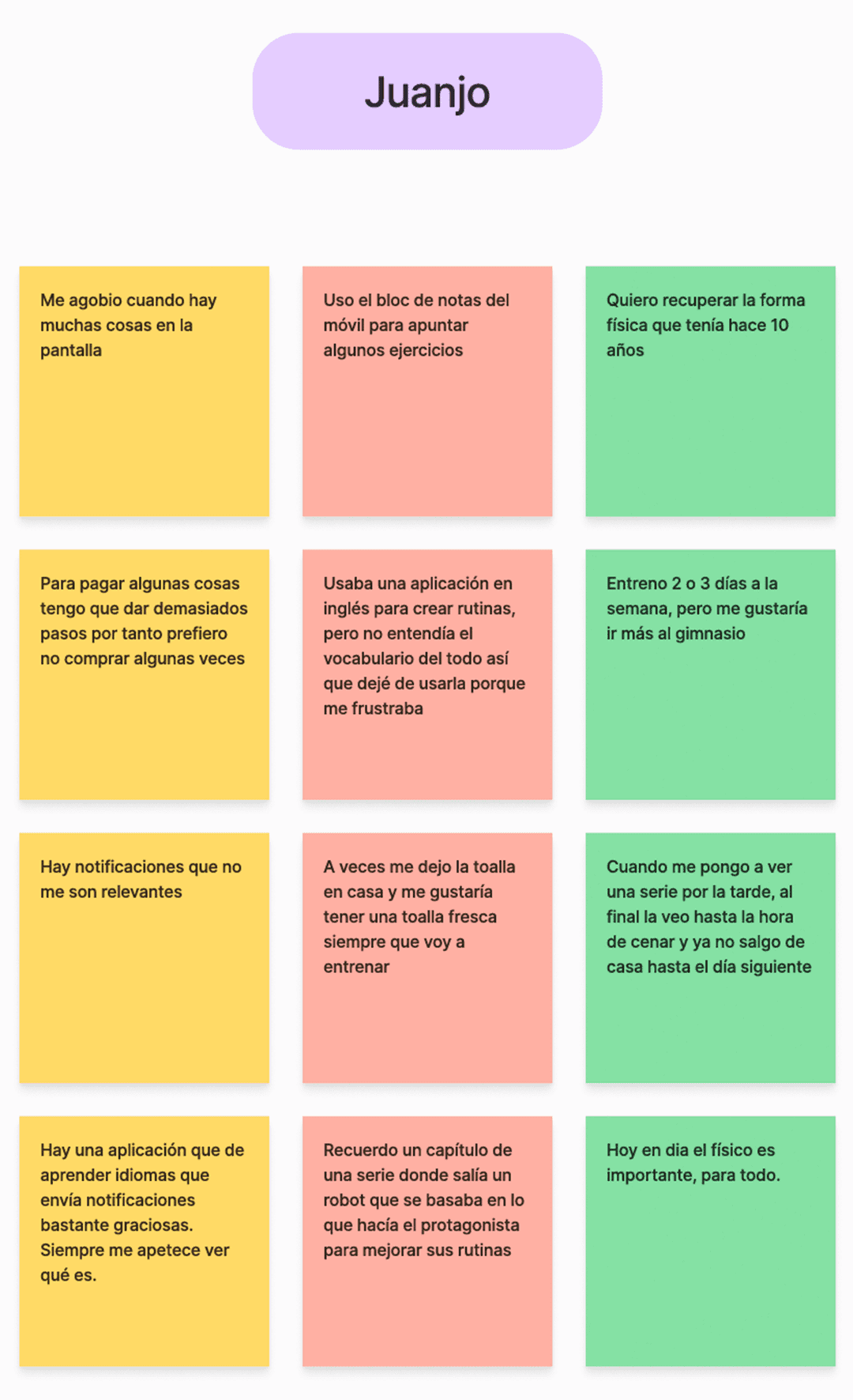
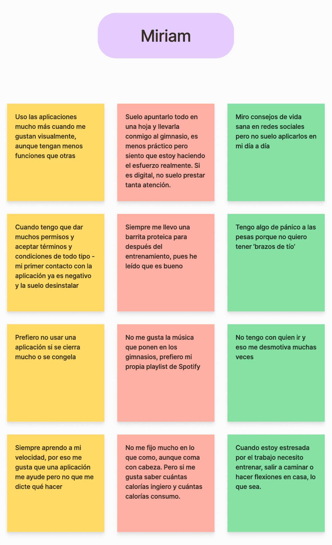
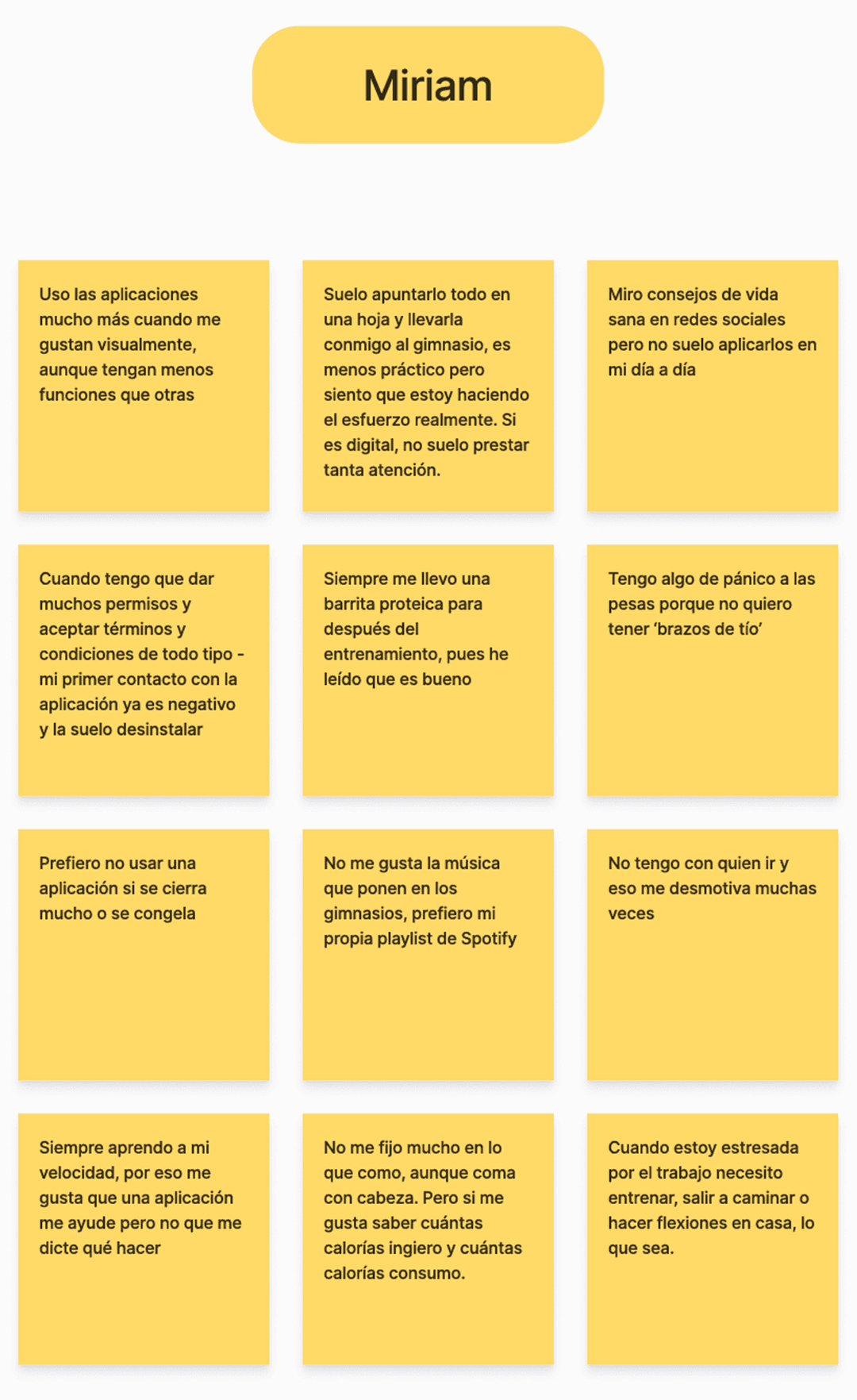
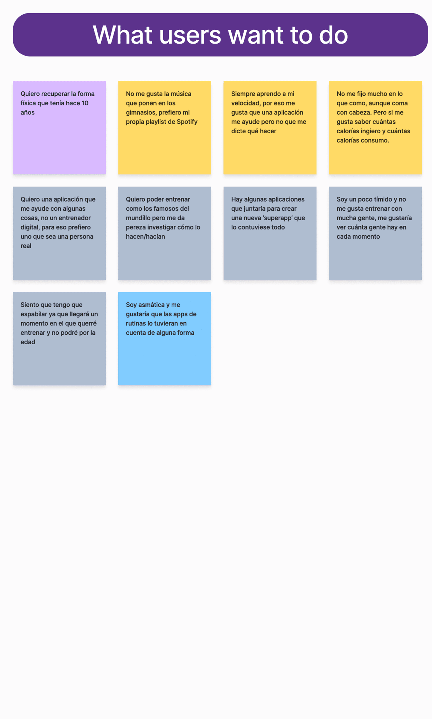
The affinity mapping was a crucial tool for synthesizing user research during this phase. Data from user interviews and other observations were organized into clusters such as: pain points, motivations and needs.
Key insights included users’ frustration with personal situations, their desire for more enjoyable experience, and the importance of timely reminders.
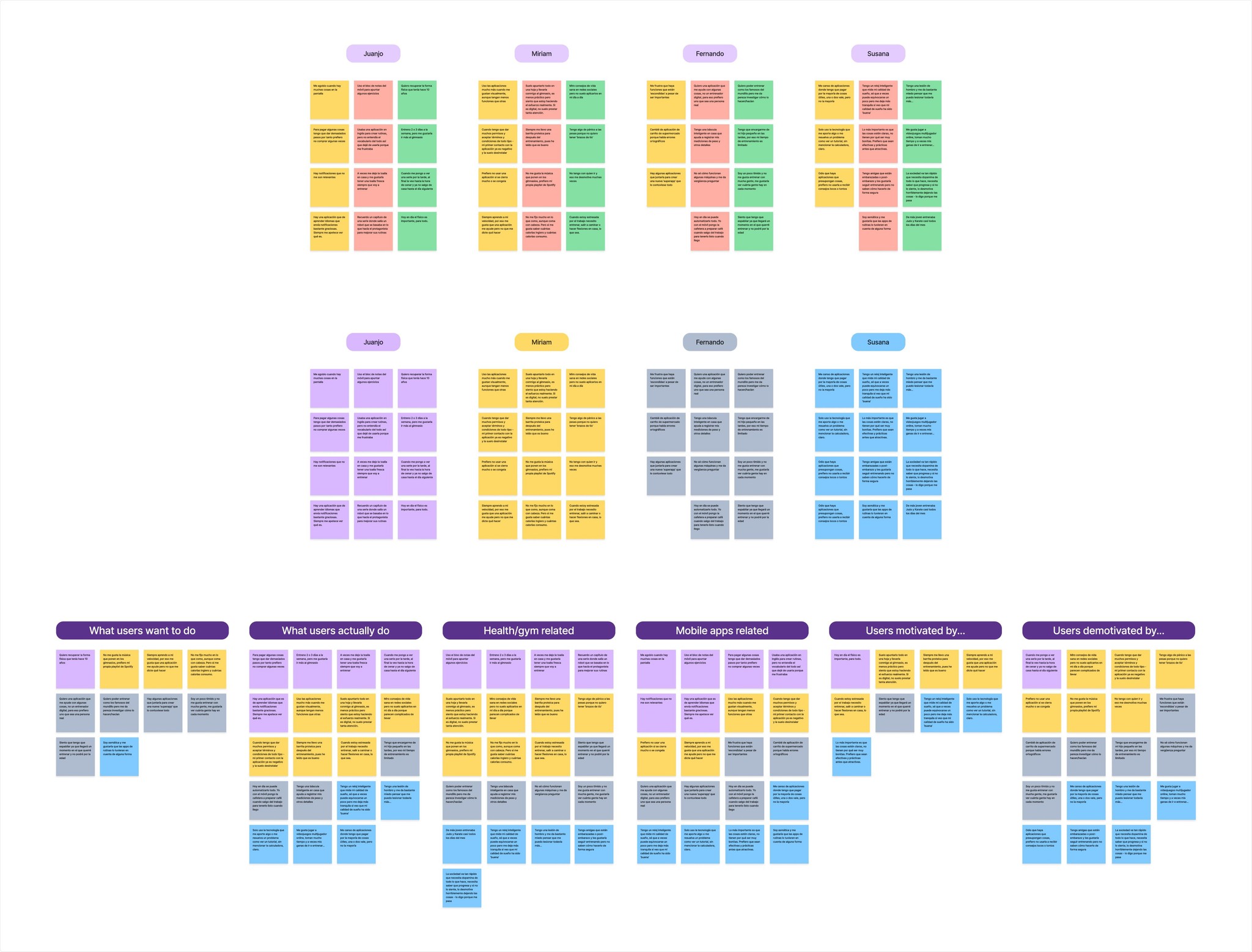
Affinity Diagram with Clusters
Gathered data was processed and displayed on sticky notes on Figjam. From raw data input from each client to assigning a theme to each card. Then, started to group the notes following different themes and topics they followed such as motivations, feature requests, etc. As the last step, refined clusters were formed after merging notes together and consolidating overlapping data.
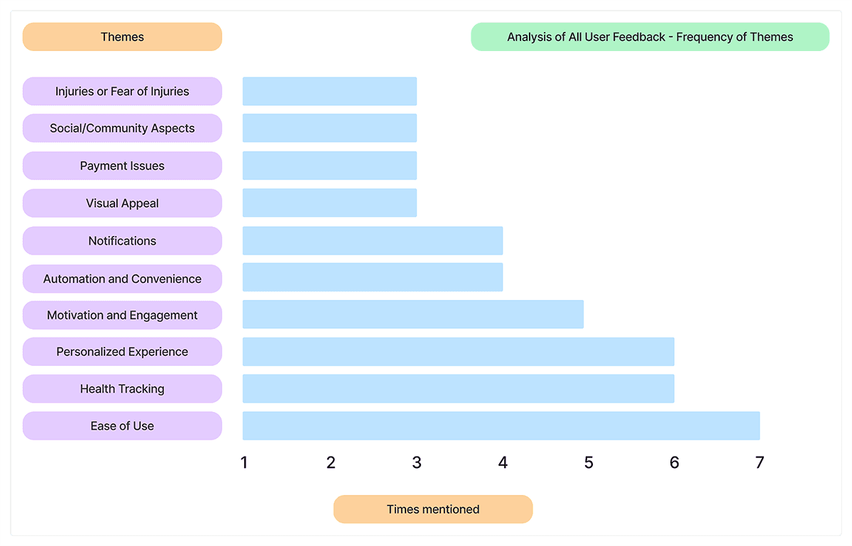
Analysis of User Feedback
All mentions have been categorized according to the topics they address. In this case, the frequency of mentions regarding certain experiences, desires, or problems expressed by users can be observed. However, despite some topics being less frequently mentioned, all are taken into consideration for the creation and improvement of the app or apps’ features.
User Interview Insights
The purpose of the methods used during user interviews was mainly to understand if the solutions offered in the app are clear and useful for their intended tasks.
Some of the key objectives were:
Finding out how many users still prefer to book services manually instead of using the app.
Making the user journey as simple as possible for both easy tasks and more complex ones (example: adding a physical injury).
Increasing the sense of community by analyzing how users feel about the app’s community features.
What do actuals user DO?
Stay home doing things like watching TV all afternoon or skip the gym entirely because they don’t have workout buddies to go with
Users feel more motivated to work out when they are part of a community or group, or if there is a strong external factor
Track their metrics, such as sleep duration or weight, through mobile apps
People want to reassure themselves about their choices and see that they are actually making progress
What do actual users WANT?
Track their calorie expenditure, check how many people are in each session, and share any limitations or injuries that prevent them from performing certain exercises
A.S.D – Advanced Session Detailing. All needed details will be available to check, before booking a class
They want to get back in shape and exercise to minimize the aging impact
Nutrition, physical therapy, and personal trainer services, along with health insights provided through the app
Conclusion
We set out to build a reliable, easy-to-use product with features that keep users motivated and excited to work out, while also including health-tracking tools to help improve their lifestyle.
One big takeaway is that Spaniards are super social, so we focused on adding social events, group workouts, and fun activities to bring people together.
Prioritizing Solutions
The analysis of the solutions was focused on prioritizing the problems according to their impact on the improvement of the app, taking into account the time that each development would cost. It should be noted that the contractor has already expressed his preferences and which solution is the most urgent, therefore from the delivery of the minimum viable product – the improvements will continue to be incorporated (in the final version) as presented throughout the analysis.
The goal is to guide product development by evaluating the impact and effort of each feature or task, allowing processes to be structured as efficiently and effectively as possible.
Quick Wins
Enhance adaptability with features like alt text and streamline onboarding by minimizing initial permission requests.
Low-Hanging Fruit
Automate tasks like gym attendance, reminders, and towels while providing simple workout stats on the app dashboard.
Major Projects
Integrate tracking for weight, calories, and progress while adding a community feature to see followers' training status.
Long-Term Investment
Streamline the app interface and processes, including payments, while providing guided workout routines with video tutorials.
Design
01
Expanding Horizons Through Combination
01
Expanding Horizons Through Combination
02
Simple and Consistent Navigation
02
Simple and Consistent Navigation
03
The Amount of Information Matters
03
The Amount of Information Matters
Wireframe Sketches and Inspirations
Initially, a series of wireframes were hand-drawn on a digital platform, guided by the sitemap. Most of the elements were retained in the prototype, with only a few minor integrations postponed for later review.


Comparative Analysis
After closely examining numerous published lifestyle, workout, and booking apps, many references were researched and analyzed. The idea is to base product development on impact-effort values in order to structure processes in the best possible way.
Inspiration is understood as any element that adds value to the project. This can include negative aspects that highlight areas for improvement or positive features that can be enhanced, reused, or expanded to make the app more complete and enjoyable for users.

Vivagym

Vinted
Amongst others, Vivagym mobile app was analyzed, along with some details from the Vinted app, to incorporate certain elements into the Viking Centro prototype. This makes it easier to see which influences were included in the prototype and which were intentionally avoided.
Modify & Incorporate
Vivagym
BasicFit
Gold's Gym
OG Gym
To change & Incorporate into the app
· There are apps like Vivagym or BasicFit that are only available if you purchase a membership which can be upsetting for users
· Information distribution can be improved, priorizing content spacing and typography choice
· Navigation and hierarchy are chaotic and may make users opt for other apps instead of the franchise’s main one
· Interface design may result outdatedAnalyze & Incorporate
Vinted
Fitify
To analyze & incorporate into the app
· Vinted’s hierarchy throught many filtering options and schemes
· Displaying various information portions throughout small spaces
· Offer chellenges not only about traveled distances but also about famous athletes workoutsInnovate &
ApplyViking Centro App (HELIOS)
Relatively innovative elements in this type of apps
· Contusion Indicator Tool: Note any physical injury that need to be taken in count by the trainer while indicating exercises routines
· Community Integration: Encourages users to exercise more by earning points, keeping them engaged with leaderboard statistics and bonuses for group workouts. Users commit to consistent exercise by spending their credits on sessions, which also contribute to their point totalsModify & Incorporate
Vivagym
BasicFit
Gold's Gym
OG Gym
To change & Incorporate into the app
· There are apps like Vivagym or BasicFit that are only available if you purchase a membership which can be upsetting for users
· Information distribution can be improved, priorizing content spacing and typography choice
· Navigation and hierarchy are chaotic and may make users opt for other apps instead of the franchise’s main one
· Interface design may result outdatedAnalyze & Incorporate
Vinted
Fitify
To analyze & incorporate into the app
· Vinted’s hierarchy throught many filtering options and schemes
· Displaying various information portions throughout small spaces
· Offer chellenges not only about traveled distances but also about famous athletes workoutsInnovate &
ApplyViking Centro App (HELIOS)
Relatively innovative elements in this type of apps
· Contusion Indicator Tool: Note any physical injury that need to be taken in count by the trainer while indicating exercises routines
· Community Integration: Encourages users to exercise more by earning points, keeping them engaged with leaderboard statistics and bonuses for group workouts. Users commit to consistent exercise by spending their credits on sessions, which also contribute to their point totals
Conclusion
After analyzing apps like Vivagym and BasicFit, I identified key areas for improvement to enhance our app’s user experience.
Offering features for non-members could make the app more inviting, addressing accessibility frustrations. Drawing inspiration from Vinted, filtering options and optimized layouts has been incorporated to better display information, creating a cleaner and more intuitive interface.
Looking ahead, potential features like athlete-inspired challenges or gamified community elements such as leaderboards and group bonuses could deepen engagement. These ideas will require further analysis to ensure alignment with user needs and app goals.
By addressing these areas, the app is positioned to deliver a superior user experience and stand out in the fitness market.
From Mid-Fi Screens to a Functional Prototype
The approach to the interface design, based on feedback provided by gym users, has gone through several phases. The process focused on visualizing information in the most optimal way possible, making the user journey easier and more intuitive.
Design System & UI Kit Elements
The Design System and UI Kit showcase a cohesive and scalable approach to digital design, including reusable components such as typography, color palettes, buttons and cards.
Built with accessibility and consistency in mind, they streamline workflows and ensure a seamless user experience across the entire product.


Information Architecture
The project has progressed through various phases during the course of its development.
Thanks to its dynamic nature as a constantly evolving product, we have been able to refine the direction of the app within its ecosystem.
Task Flow
To provide a clearer understanding of the main structure, four examples are included:
A user journey illustrating the registration process and the use of a free session token, along with secondary paths for completing user profile information and adding observations for the specialist of a booked session.
Three user flows showcasing additional examples of the app’s functionality and overall navigation.
01
How the Structure Works
02
User's Journey Focus
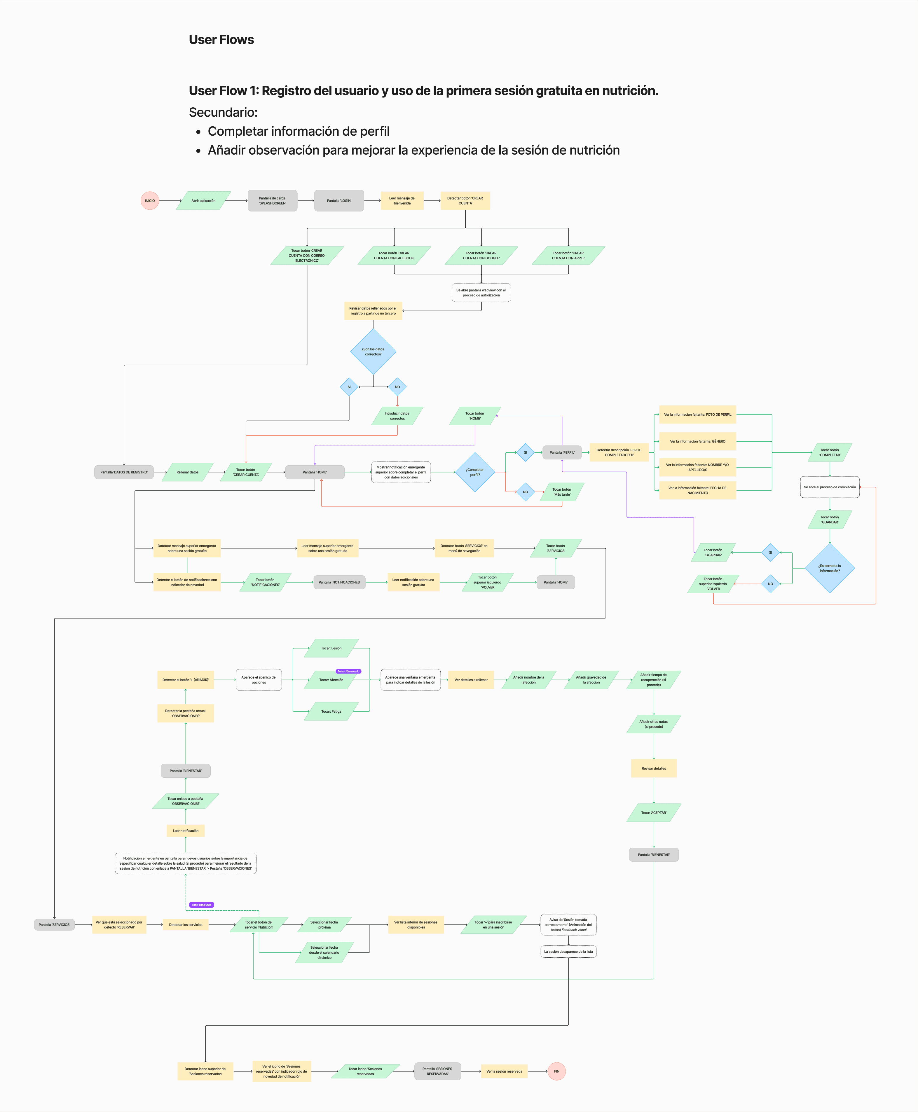
Booking a session from the main screen and confirming it + secondary paths
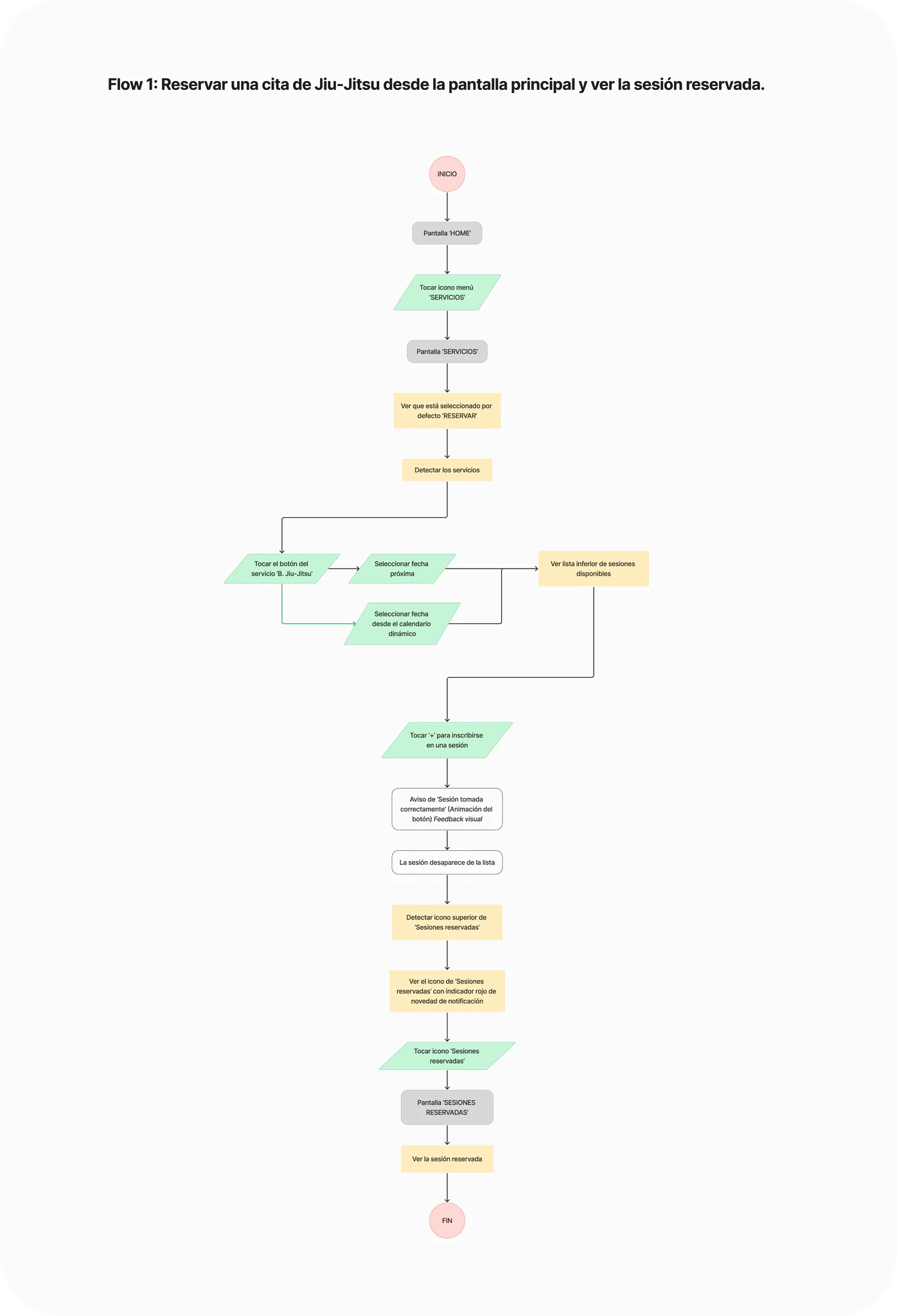
Booking a Jiu-Jitsu session and verifying if the operation has beed completed
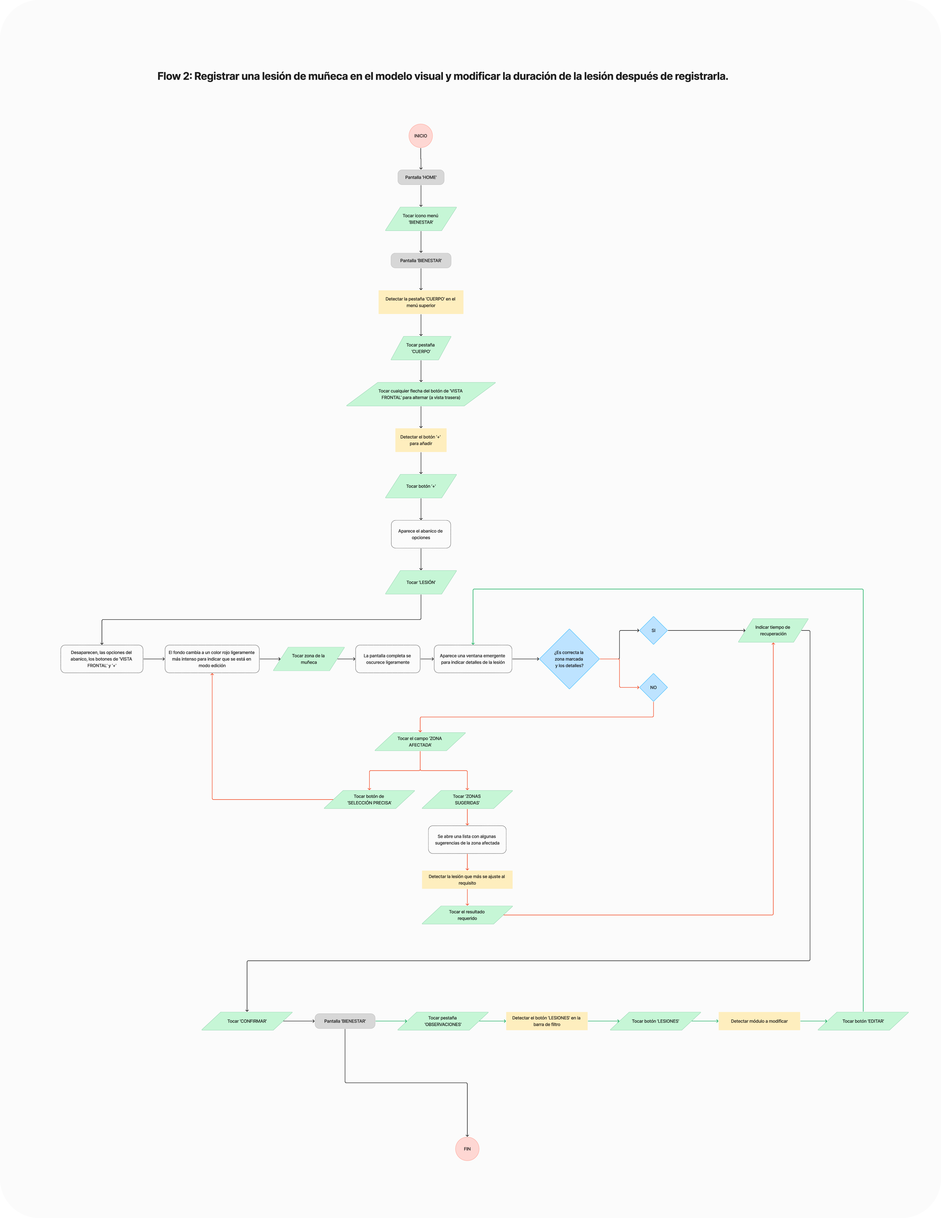
Registering an injury on the 3D human body model and adjusting the recovery time after the entry is created
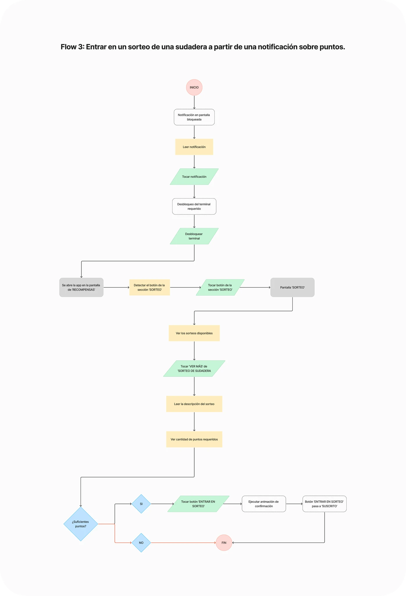
Participating in a hoodie giveaway prompted by a notification about sufficient available points
Cracks in the Blueprint
Several elements proposed during the research phases have been partially discarded or their launch postponed due to their interference with the main features of the app. Discarding these elements resulted in slight adjustments to the distribution of features across the screens.
Certain features, such as an AI Trainer or custom routines and workouts, need to be carefully reviewed to ensure alignment with the apps' value proposition and brand identity. For instance, one of the core features of the app is booking workout sessions led by professional trainers. Adding an AI trainer could potentially undermine this functionality.
However, it could be introduced as a complementary feature, offering additional benefits without disrupting the primary service. Similarly, for features like nutrition plans, these will be incorporated into the app but will not rely on artificial intelligence. To maintain the app's value proposition, nutrition plans may function as recommendations and personalized diet plans provided by specialists, preserving the human expertise central to the app's identity.
What did happen next?
01
Development
01
Development
02
Testing & Quality Assurance
02
Testing & Quality Assurance
03
Deployment
03
Deployment
04
Maintenance & Support
04
Maintenance & Support
04
Key Takeaways
04
Key Takeaways
Viking Centro App (HELIOS)
A real case describing the process of creating a mobile app for a digital ecosystem designed for comprehensive management of a gym chain, focused on task optimization and time efficiency.
Project category: Mobile app (part of a SaaS project as B2B product)
Function: Exclusive UI/UX & Graphic Designer, Analyst, Researcher and Tester
Field: Booking and Scheduling (MVP) – Fitness & Lifestyle (Growth & Scaling phase)
Tools: Figma, FigJam, Adobe Illustrator, Lucidchart, Zoom
Duration: 20 weeks
Client
Viking Centro
Type
Product Design
Year
2023-2024
Caring about structure
File's layers consistently renamed.
Components as automation
Component management and advanced prototyping.
Caring about accessibility
W3C Accessibility Guidelines Color Contrast Compliant.
Brief Overview
The Viking Centro mobile app is an ambitious project consisting of two parts: user part and administrator/coach part (administrative roles). The tool would mainly be used by users to create an account, book sessions for services or classes of their preference. Additionally, these sessions can also be paid directly through the app.
One of many other key functions is the bunch session configurator. Using this feature, users can adjust the quantities and times of their sessions so the product itself can automatically reserve these available slots. Other features include: service filters, reminders, management of invoices or information about the different centers of the Viking Centro gym chain.
The MVP version of the software, as established with the client; will benefit from future changes, including various improvements such as physical activity tracking features, gamification methods and activity logging between users, among others.
Main Project Goals
The primary goal of the app is to offer an increasingly diverse range of features while focusing on retaining existing customers and providing added value that enhances the business’s offerings.
On the other hand, the goal of the MVP version is to simplify tasks for users, optimize their daily free time, and deliver an easy-to-use interface for it. Additionally, it supports trainers and other specialists by helping them manage appointments and keep track of all their training sessions. A key focus is on resource automation, achieved through integration with a dashboard. This dashboard allows for managing various aspects of the business, such as enabling or disabling app functions, analyzing invoices, and tracking profits for future operations.
The overarching project objective is business growth, with an estimated 25-40% increase in profit within the first year of the apps’ launch.
App Goals
The primary objective of this product is not just to create a mobile app for booking management. Instead, it aims to build a system that can evolve through iterative improvements and feature integrations, ultimately becoming a fully integrated component of a broader ecosystem. This ecosystem is designed to continuously enhance the user experience, driven by feedback from customers, developers, and other stakeholders.
As outlined earlier, the app is being developed in two phases: the MVP version, which has already been launched with essential features, and the feature-complete version. The feature-complete version, currently in development, will introduce advanced features to provide a comprehensive and seamless gym experience.
Investigation
Analysis
Enhancement
Requirements Gathering
Target Audience
Even though there was already a target audience for the product, it was still necessary to fully understand them. To achieve this, some practical methods were implemented, including User Profiling and Contextual Inquiry.
These two methods have allowed for a deeper understanding of the users’ pain points, their daily situations in which they would use the app, and some other preferences.
Pablo Montoya García
Age: 42
Gender: Male
Location: Zaragoza, Spain
Occupation: retired urban planner
Education level: Bachelor’s Degree
Income level: High (~96.000€)
Frequently-used Apps
01
Biography
02
Goals & Motivations
03
Pain Points & Frustrations
Vanesa Rincón Gallardo
Age: 33
Gender: Female
Location: Valencia, Spain
Occupation: Enterpreneur, Podiatrist
Education level: Master’s Degree
Income level: Medium-high (~42.000€)
Frequently-used Apps
01
Biography
02
Goals & Motivations
03
Pain Points & Frustrations
User Interview
A total of 4 people aged between 27 and 43 have been interviewed. The platform used for this process was Zoom. Three groups of questions were developed, covering as many relevant areas as possible for this study.
Technical Questions
Referring to experiences with mobile apps.
Navigation within them and what is intended to be made easier through their use.
Fitness & Lifestyle Questions
Related to the frequency of physical training, what is most enjoyable during workouts and similar questions.
Personal Questions & Experiences
Personal-level questions within the fitness area.
Use of apps to monitor progress, essential tools for every workout, or features that would be useful if digitized or integrated into an app.
All of these questions are focused to:
Understand their perception of the apps they use, particularly focusing on how easy it is to complete tasks within them.
Explore their relationship with technology.
Gauge their level of interest in physical activity.
Identify their motivations or demotivations.
Determine what can be improved or created to ensure the product enhances their experience, making them feel it complements their gym-related activities effectively.
"I got injured at work while rearranging some huge boxes. I have a sprain on my left wrist, and I want to keep training, but I’m afraid of making the situation worse."
Sandra
Client of Viking Centros' gym chain
Analysis
Affinity Mapping
The affinity mapping was a crucial tool for synthesizing user research during this phase. Data from user interviews and other observations were organized into clusters such as: pain points, motivations and needs.
Key insights included users’ frustration with personal situations, their desire for more enjoyable experience, and the importance of timely reminders.
Affinity Diagram with Clusters
Gathered data was processed and displayed on sticky notes on Figjam. From raw data input from each client to assigning a theme to each card. Then, started to group the notes following different themes and topics they followed such as motivations, feature requests, etc. As the last step, refined clusters were formed after merging notes together and consolidating overlapping data.


Analysis of User Feedback
All mentions have been categorized according to the topics they address. In this case, the frequency of mentions regarding certain experiences, desires, or problems expressed by users can be observed. However, despite some topics being less frequently mentioned, all are taken into consideration for the creation and improvement of the app or apps’ features.
User Interview Insights
The purpose of the methods used during user interviews was mainly to understand if the solutions offered in the app are clear and useful for their intended tasks.
Some of the key objectives were:
Finding out how many users still prefer to book services manually instead of using the app.
Making the user journey as simple as possible for both easy tasks and more complex ones (example: adding a physical injury).
Increasing the sense of community by analyzing how users feel about the app’s community features.
Conclusion
We set out to build a reliable, easy-to-use product with features that keep users motivated and excited to work out, while also including health-tracking tools to help improve their lifestyle.
One big takeaway is that Spaniards are super social, so we focused on adding social events, group workouts, and fun activities to bring people together.
Prioritizing Solutions
The analysis of the solutions was focused on prioritizing the problems according to their impact on the improvement of the app, taking into account the time that each development would cost. It should be noted that the contractor has already expressed his preferences and which solution is the most urgent, therefore from the delivery of the minimum viable product – the improvements will continue to be incorporated (in the final version) as presented throughout the analysis.
The goal is to guide product development by evaluating the impact and effort of each feature or task, allowing processes to be structured as efficiently and effectively as possible.
Quick Wins
Enhance adaptability with features like alt text and streamline onboarding by minimizing initial permission requests.
Low-Hanging Fruit
Automate tasks like gym attendance, reminders, and towels while providing simple workout stats on the app dashboard.
Major Projects
Integrate tracking for weight, calories, and progress while adding a community feature to see followers' training status.
Long-Term Investment
Streamline the app interface and processes, including payments, while providing guided workout routines with video tutorials.
Design
01
Expanding Horizons Through Combination
02
Simple and Consistent Navigation
03
The Amount of Information Matters
Wireframe Sketches and Inspirations
Initially, a series of wireframes were hand-drawn on a digital platform, guided by the sitemap. Most of the elements were retained in the prototype, with only a few minor integrations postponed for later review.
Comparative Analysis
After closely examining numerous published lifestyle, workout, and booking apps, many references were researched and analyzed. The idea is to base product development on impact-effort values in order to structure processes in the best possible way.
Inspiration is understood as any element that adds value to the project. This can include negative aspects that highlight areas for improvement or positive features that can be enhanced, reused, or expanded to make the app more complete and enjoyable for users.
Vivagym
Vinted
Amongst others, Vivagym mobile app was analyzed, along with some details from the Vinted app, to incorporate certain elements into the Viking Centro prototype. This makes it easier to see which influences were included in the prototype and which were intentionally avoided.
Modify & Incorporate
Vivagym
BasicFit
Gold's Gym
OG Gym
To change & Incorporate into the app
· There are apps like Vivagym or BasicFit that are only available if you purchase a membership which can be upsetting for users · Information distribution can be improved, priorizing content spacing and typography choice · Navigation and hierarchy are chaotic and may make users opt for other apps instead of the franchise’s main one · Interface design may result outdated
Analyze & Incorporate
Vinted
Fitify
To analyze & incorporate into the app
· Vinted’s hierarchy throught many filtering options and schemes · Displaying various information portions throughout small spaces · Offer chellenges not only about traveled distances but also about famous athletes workouts
Innovate & Apply
Viking Centro App (HELIOS)
Relatively innovative elements in this type of apps
· Contusion Indicator Tool: Note any physical injury that need to be taken in count by the trainer while indicating exercises routines · Community Integration: Encourages users to exercise more by earning points, keeping them engaged with leaderboard statistics and bonuses for group workouts. Users commit to consistent exercise by spending their credits on sessions, which also contribute to their point totals
Conclusion
After analyzing apps like Vivagym and BasicFit, I identified key areas for improvement to enhance our app’s user experience.
Offering features for non-members could make the app more inviting, addressing accessibility frustrations. Drawing inspiration from Vinted, filtering options and optimized layouts has been incorporated to better display information, creating a cleaner and more intuitive interface.
Looking ahead, potential features like athlete-inspired challenges or gamified community elements such as leaderboards and group bonuses could deepen engagement. These ideas will require further analysis to ensure alignment with user needs and app goals.
By addressing these areas, the app is positioned to deliver a superior user experience and stand out in the fitness market.
From Mid-Fi Screens to a Functional Prototype
The approach to the interface design, based on feedback provided by gym users, has gone through several phases. The process focused on visualizing information in the most optimal way possible, making the user journey easier and more intuitive.
Design System & UI Kit Elements
The Design System and UI Kit showcase a cohesive and scalable approach to digital design, including reusable components such as typography, color palettes, buttons and cards.
Built with accessibility and consistency in mind, they streamline workflows and ensure a seamless user experience across the entire product.
Typography
Fields
Color Palette
Others
Calendar
Screens
Effects
UI Samples
Information Architecture
The project has progressed through various phases during the course of its development.
Thanks to its dynamic nature as a constantly evolving product, we have been able to refine the direction of the app within its ecosystem.
Task Flow
To provide a clearer understanding of the main structure, four examples are included:
A user journey illustrating the registration process and the use of a free session token, along with secondary paths for completing user profile information and adding observations for the specialist of a booked session.
Three user flows showcasing additional examples of the app’s functionality and overall navigation.
01
How the Structure Works
02
User's Journey Focus
Booking a session from the main screen and confirming it + secondary paths
Booking a Jiu-Jitsu session and verifying if the operation has beed completed
Registering an injury on the 3D human body model and adjusting the recovery time after the entry is created
Participating in a hoodie giveaway prompted by a notification about sufficient available points
Cracks in the Blueprint
Several elements proposed during the research phases have been partially discarded or their launch postponed due to their interference with the main features of the app. Discarding these elements resulted in slight adjustments to the distribution of features across the screens.
Certain features, such as an AI Trainer or custom routines and workouts, need to be carefully reviewed to ensure alignment with the apps' value proposition and brand identity. For instance, one of the core features of the app is booking workout sessions led by professional trainers. Adding an AI trainer could potentially undermine this functionality.
However, it could be introduced as a complementary feature, offering additional benefits without disrupting the primary service. Similarly, for features like nutrition plans, these will be incorporated into the app but will not rely on artificial intelligence. To maintain the app's value proposition, nutrition plans may function as recommendations and personalized diet plans provided by specialists, preserving the human expertise central to the app's identity.
What did happen next?
01
Development
02
Testing & Quality Assurance
03
Deployment
04
Maintenance & Support
04
Key Takeaways
The only thing we don't get back is time ⌚
...and I want to thank you by spending it on checking my work! :)
Do you like what you see?
🧩 Let's connect!
Got something cool in the works?
A fresh idea brewing? Time to act!
You’re about to reach out to best solution, and that means we’re getting down to business right away.🚀
Got something cool in the works?
A fresh idea brewing? Time to act!
You’re about to reach out to best solution, and that means we’re getting down to business right away.🚀